In Chapter 3, we looked at building components for Blazor. But we are not done yet. There is still a lot more we need to discuss about components. One of the things we really need to look at is templated components and Razor templates. Then we will look at component libraries, virtualization, and dynamic components.
Using Templated Components
Components are Blazor’s building block for reuse. In C#, generics are heavily used for reuse; just think about all the collections like List<T> you use with generics. Would it not be cool if Blazor had something like generic components? Yes, Blazor does!
Blazor supports templated components where you can specify one or more UI templates as parameters, making templated components even more reusable! For example, your application could be using grids all over the place. You can now build a templated component for a Grid taking the type used in the grid as a parameter (very much like you can build a generic type in .NET) and specify the UI used for each item separately! Let’s look at an example.
Creating the Grid Templated Component
Create a new Blazor project; call it Components.Advanced. Now add a new razor component to the project’s Pages folder and name it Grid as in Listings 4-1 and 4-2.
This is a templated component because it states the TItem as a type parameter using the @typeparam TItem syntax in the razor file. Look at the partial Grid<TItem> class for this from Listing 4-1. This is a generic type stated in C#. Compare this with class List<T> where T is a type parameter. You can have as many type parameters as you like; simply list each type parameter using the @typeparam syntax, but for this Grid<TITem> component, we only need one.
using Microsoft.AspNetCore.Components;
using System.Collections.Generic;
namespace Components.Advanced.Pages
{
public partial class Grid<TItem>
{
[Parameter]
public RenderFragment Header { get; set; } = default!;
[Parameter]
public RenderFragment<TItem> Row { get; set; } = default!;
[Parameter]
public RenderFragment Footer { get; set; } = default!;
[Parameter]
public IReadOnlyList<TItem> Items { get; set; } = default!;
}
}
Listing 4-1
The Templated Grid Component’s Code
@typeparam TItem
<table border="1">
<thead>
<tr>@Header</tr>
</thead>
<tbody>
@foreach (var item in Items)
{
<tr>@Row(item)</tr>
}
</tbody>
<tfoot>
<tr>@Footer</tr>
</tfoot>
</table>
Listing 4-2
The Templated Grid Component’s Markup
The Grid component has four parameters. The Header and Footer parameters are of type RenderFragment which represents some markup (HTML, Blazor components) which we can specify when we use the Grid component (we will look at an example right after explaining the Grid component further). Look for the <thead> element in Listing 4-2 in the Grid component. Here, we use the @Header razor syntax telling the Grid component to put the markup for the Header parameter here. Same thing for the Footer.
The Row parameter is of type RenderFragment<TItem> which is a generic version of RenderFragment. In this case, you can specify markup with access to the TItem instance allowing you access to properties and methods of the TItem. The Items parameter here is an IReadOnlyList<TItem> which can be data bound to any class with the IReadOnlyList<TItem> interface, for example, a List<T>. Look for the <tbody> element in Listing 4-2. We iterate over all the items (of type TItem) of the IReadOnlyList<TItem> using a foreach loop, and we use the @Row(item) razor syntax to apply the Row parameter, passing the current item as an argument.
Using the Grid Templated Component
Now let’s look at an example of using the Grid templated component. Open the FetchData component in the Components.Advanced project. Replace the <table> with the Grid component as in Listing 4-3.
Note
The FetchData component uses a couple of things such as @page and @inject we will discuss in later chapters, so bear with the example.
The FetchData component uses the Grid component specifying the Items parameter as the forecasts array of WeatherForecast instances. Look again at the type of Items in the Grid component: IReadOnlyList<TItem>. The compiler is smart enough to infer from this that the Grid’s type parameter (TItem) is the WeatherForecast type. I love type inference!
@page "/fetchdata"
@inject HttpClient Http
<h1>Weather forecast</h1>
<p>This component demonstrates fetching data from the server.</p>
public int TemperatureF => 32 + (int)(TemperatureC / 0.5556);
}
}
Listing 4-3
Using the Grid Templated Component in the FetchData Component
Now look at the Header parameter of the Grid component in Listing 4-3. This syntax will bind whatever is inside the <Header> element to the Grid’s Header parameter which is of type RenderFragment. In this example, we specify some HTML table headers (<th>). The grid will put these inside the table row (<tr>) element from Listing 4-2. The Footer parameter is similar.
Examine the Row parameter in Listing 4-3. Inside the <Row> element, we want to use the current item from the iteration in Listing 4-2. But how should we access the current item? By default, Blazor will pass the item as the context argument (of type TItem), so you would access the date of the forecast instance as @context.Date.
You can override the name of the argument as shown in Listing 4-4. This is what we do with the Context parameter (provided by Blazor) using <Row Context="forecast">. Now the item from the iteration can be accessed using the forecast argument. Can you guess what the output of the Grid will be?
<Grid Items="forecasts">
<Header>
<th>Date</th>
<th>Temp. (C)</th>
<th>Temp. (F)</th>
<th>Summary</th>
</Header>
<Row Context="forecast">
<!-- by default called context, but now called forecast -->
<td>@forecast.Date</td>
<td>@forecast.TemperatureC</td>
<td>@forecast.TemperatureF</td>
<td>@forecast.Summary</td>
</Row>
<Footer>
<td colspan="4">Spring is in the air!</td>
</Footer>
</Grid>
Listing 4-4
Overriding the Context Argument
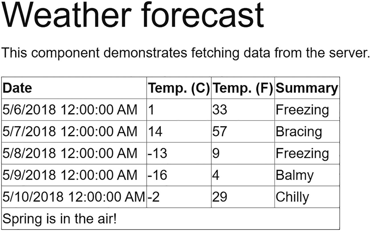
Run your solution and select the Fetch data link from the navigation menu. Admire your new templated component as in Figure 4-1!
Figure 4-1
Showing Forecasts with the Grid Templated Component
Now we have a reusable Grid component that we can use to show any list of items passing the list to the Items parameters and specifying what should be shown in the Header, Row, and Footer parameters! But there is more!
Specifying the Type Parameter’s Type Explicitly
Normally, the compiler can infer the type of the TItem type parameter, but if this does not work as you expect, you can specify the type explicitly. Please note that this is the name of the type parameter, same as List<TItem>. You can use any name that makes sense. Simply specify the type of your type parameter by specifying it as TItem (the name of the type parameter used in the templated component) when you use the component as in Listing 4-5.
public class DisposableList<T> where T : IDisposable
Listing 4-6
Generics Using a Constraint
We can do the same for templated components. For example, we could state that TItem should implement IDisposable for the Grid templated component as shown in Listing 4-7.
@typeparam TItem where TItem: IDisposable
Listing 4-7
Using Constraints with a Templated Component
Razor Templates
In templated components, you can have parameters of type RenderFragment, which can then be given a value using markup. You can also give a RenderFragment or RenderFragment<TItem> a value using a Razor template.
A Razor template is a way to define a UI snippet, for example, @<span>Hello!</span>, which you can then pass into a RenderFragment. A Razor template generally uses the @<element>...</element> syntax. In the example’s case, we specify a RenderFragment without any arguments, for example, to use in the Grid’s Header parameter. But if you need to pass an argument to the RenderFragment<TItem>, you create a Razor template using a syntax that looks a lot like a lambda function.
Think of a Razor template as special C# syntax for creating a RenderFragment.
Let’s look at an example. Start by adding a new component called ListView as in Listings 4-8 and 4-9. This will show an unordered list of items (of type TItem) using <ul> and <li> HTML elements.
using Microsoft.AspNetCore.Components;
using System.Collections.Generic;
namespace Components.Advanced.Pages
{
public partial class ListView<TItem>
{
[Parameter]
public RenderFragment<TItem> ItemTemplate { get; set; }
= default!;
[Parameter]
public IReadOnlyList<TItem> Items { get; set; }
= default!;
}
}
Listing 4-8
The Template ListView Component’s Code
@typeparam TItem
<ul>
@foreach (var item in Items)
{
<li>
@ItemTemplate(item)
</li>
}
</ul>
Listing 4-9
The Templated ListView Component’s Markup
Now add the ListView to the FetchData component as in Listing 4-10 (I have left out most of the unchanged parts). The ItemTemplate parameter now uses the forecastTemplate RenderFragment which is specified in the @code section. Look at the forecastTemplate in Listing 4-10. This uses a syntax very similar to a C# lambda function taking the forecast as an argument and returns a RenderFragment<TItem> using the (forecast) => @<span>@forecast.Summary</span> razor syntax.
In the ListView component’s ItemTemplate, we simply invoke the template as if it was a lambda function. So you could say that a Razor template is like an invokable function returning a RenderFragment!
Using the ListView Component with a RenderFragment
Wig-Pig Syntax
Let’s go wild: can we have a RenderFragment<RenderFragment>? Currently, our ListView<TItem> is using an <ul> to wrap the items, but what if the user of the ListView<TItem> wants to use an <ol> or something different?
Looking at Listing 4-9, this means that we want to be able to replace the outer (<ul>) markup with a template, loop over the items, and use another template to render each item.
Create a new component called ListView2 as in Listings 4-11 and 4-12 (kind of enhanced version of ListView). Note that in Listing 4-11 the ListTemplate parameter is of type RenderFragment<RenderFragment>. Why would we want this? Because we want to use the ListTemplate as a wrapper around another RenderFragment, so RenderFragment<RenderFragment> makes sense!
using Microsoft.AspNetCore.Components;
using System.Collections.Generic;
namespace Components.Advanced.Pages
{
public partial class ListView2<TItem>
{
[Parameter]
public RenderFragment<RenderFragment>? ListTemplate
{ get; set; }
[Parameter]
public RenderFragment<TItem> ItemTemplate
{ get; set; } = default!;
[Parameter]
public IReadOnlyList<TItem> Items
{ get; set; } = default!;
}
}
Listing 4-11
Using a RenderFragment<RenderFragment>
@typeparam TItem
@if(ListTemplate is null )
{
<ul>
@foreach (var item in Items)
{
<li>
@ItemTemplate(item)
</li>
}
</ul>
} else
{
}
Listing 4-12
The ListView2 Component
The markup for ListView2 currently will use a default <ul> list in case the ListTemplate is not used (and that is why it is set as nullable). But now we need to talk about using the ListTemplate. What do we want? We want the ListTemplate to wrap the foreach loop which then calls the ItemTemplate. So we need to pass a RenderFragment to it that will contain the foreach loop. But how can we do this in our component?
Let me introduce you to the pig-wig syntax: @:@{. It is called like that because it looks like a grumpy pig with a wig (not my invention!).
Inside our ListView2 component, we will invoke the ListTemplate as in Listing 4-13, which uses the pig-wig syntax passing a RenderFragment that loops over each item and calls the ItemTemplate. The pig-wig syntax consists of two parts. The @: part tells razor to switch to C# mode, and the @{ tells the C# compiler to create a Razor template.
@typeparam TItem
@if(ListTemplate is null )
{
...
} else
{
@ListTemplate(
@:@{
foreach(var item in Items)
{
@ItemTemplate(item)
}
}
)
}
Listing 4-13
Using the Pig-Wig Syntax
Time to use the ListView2 component as in Listing 4-14. Please add this to the FetchData component below the first ListView. Since the ListTemplate takes a RenderFragment as an argument, we call the context (called innerTemplate) here, wrapped in the markup for the list. This will call the foreach loop which will call the ItemTemplate. So as the consumer of a ListView2 component, you provide the ListTemplate, but also call the innerTemplate to allow the ListView2 component to render its pig-wig template. Phew…
<ListView2 Items="forecasts">
<ListTemplate Context="innerTemplate">
<ol>
@innerTemplate
</ol>
</ListTemplate>
<ItemTemplate Context="forecast">
<li>@forecast.Summary</li>
</ItemTemplate>
</ListView2>
Listing 4-14
Using a Templated Component with ListTemplate
Using Blazor Error Boundaries
With reusable components like templated components, you allow the user of your component to inject their own logic. But what is that logic is flawed and starts throwing exceptions?
Blazor error boundaries allow you to handle exceptions within your component and to provide some nice UI indicating the problem, without the exception taking the rest of the page down with it.
Let us use an example: start by updating the class to throw an exception when it is too cold as in Listing 4-15.
Running the application and choosing the FetchData component will crash the whole page. Not a nice user experience.
Update the Grid templated component to use the ErrorBoundary component as in Listing 4-16. To protect any place where you want to display an error UI if the inner element throws an exception, wrap it with an ErrorBoundary.
@typeparam TItem
<table border="1">
<thead>
<tr>@Header</tr>
</thead>
<tbody>
@foreach (var item in Items)
{
<ErrorBoundary>
<tr>@Row(item)</tr>
</ErrorBoundary>
}
</tbody>
<tfoot>
<tr>@Footer</tr>
</tfoot>
</table>
Listing 4-16
Using an ErrorBoundary
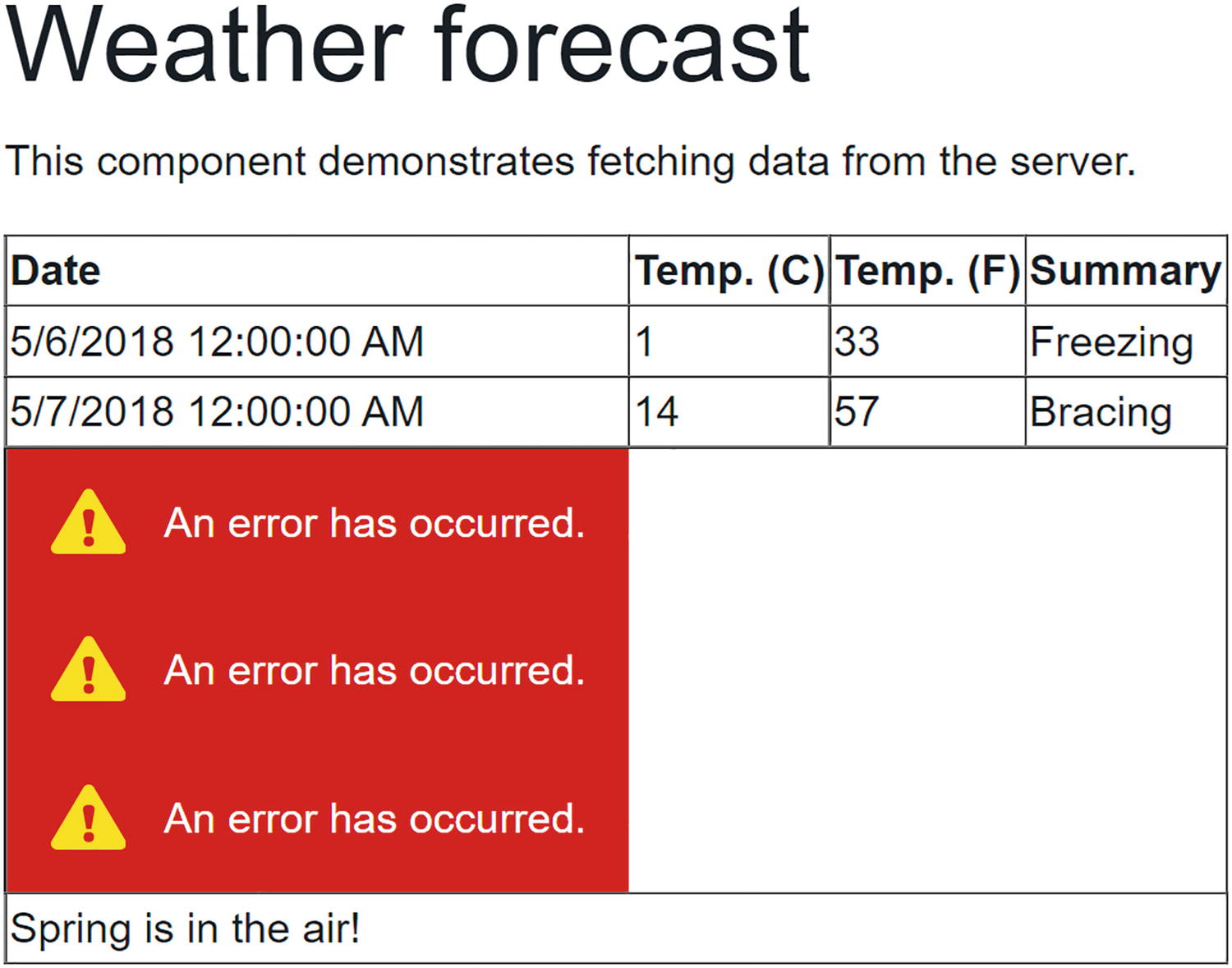
Running the application and choosing the FetchData component will now result in errors being shown as in Figure 4-2.
Figure 4-2
Using the ErrorBoundary
By default, the ErrorBoundary’s error UI uses an empty div with the blazor-error-boundary CSS class. You can customize this CSS class to change the error UI for the whole application.
You can also customize the error UI of a specific ErrorBoundary component using its ErrorContent parameter, with an example shown in Listing 4-17.
<ErrorBoundary>
<ChildContent>
<tr>@Row(item)</tr>
</ChildContent>
<ErrorContent>
<div>Too cold!</div>
</ErrorContent>
</ErrorBoundary>
Listing 4-17
Customizing an ErrorBoundary
Building a Component Library
Components should be reusable. But you don’t want to reuse a component between projects by copy-pasting the component between them. In this case, it is much better to build a component library, and as you will see, this is not hard at all! By putting your Blazor components into a component library, you can include it into different Blazor projects, use it both for client-side Blazor and server-side Blazor, and even publish it as a NuGet package!
What we will do now is to move the Grid and ListView2 component to a library, and then we will use this library in our Blazor project.
Creating the Component Library Project
Depending on your development environment, creating a component library is different. We will look at using Visual Studio and the dotnet CLI (which is development environment agnostic, so this works no matter your choice of IDE).
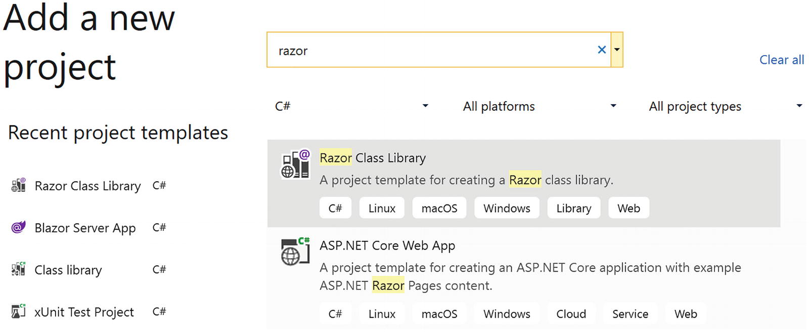
With Visual Studio, right-click your solution, and select Add New Project. Look for the Razor Class Library project template as in Figure 4-3.
Figure 4-3
Add a New Component Library Project
Click Next. Name this project Components.Library, select the folder next to your other project, and click Next. In the next screen, click Create.
With dotnet CLI, open a command prompt or use the integrated terminal from Visual Studio Code (you can use Ctrl-` as a shortcut to toggle the terminal in Code). Change the current directory to the folder where your other projects are. Type in the following command:
dotnet new razorclasslib -n Components.Library
The dotnet new command will create a new project based on the razorclasslib template. If you want the project to be created in a subdirectory, you can specify it using the -o <<subdirectory>> parameter.
Executing this command should show you output like
The template "Razor Class Library" was created successfully.
Change to the solution’s directory. Add it to your solution by typing in the next command (with <<path-to>> a place holder for you to replace):
dotnet sln add <<path-to>>Components.Library
Adding Components to the Library
First, open the Components.Library project file and add support for nullable reference types:
<Project Sdk="Microsoft.NET.Sdk.Razor">
<PropertyGroup>
<TargetFramework>net6.0</TargetFramework>
<Nullable>enable</Nullable>
</PropertyGroup>
Also remove all existing files (except the _Imports.razor file and wwwroot folder) in the library project.
Previously, we built a couple of templated components. Some of these are very reusable, so we will move them to our library project. Start with Grid.
Move (you can use Shift-Drag-and-Drop) the Grid.razor and Grid.razor.cs files from your Components.Advanced project to the Components.Library project.
Do the same for ListView2 component. Both components are still using the client’s namespace, so update their namespace to Components. Library.
Building the library project should succeed. Building the solution will still get compiler errors from the client project because we need to add a reference from the client project to the component library, which we will fix in the next part.
Referring to the Library from Your Project
Now that our library is ready, we are going to use it in our project. The way the library works means we can also use it in other projects (just like any other library project in .NET). Hey, you could even make it into a NuGet package (if you want more information, look at https://docs.microsoft.com/dotnet/core/deploying/creating-nuget-packages) and let the rest of the world enjoy your work!
To use our component library in a project, we have two options.
Using Visual Studio, start by right-clicking the client project and select Add ➤ Project Reference. Make sure you check Components.Library and click OK. Blazor component libraries are just another kind of library/assembly.
Using the project file (e.g., with Visual Studio Code), open the Components.Advanced.csproj file and add the <ProjectReference> element to it as in Listing 4-18.
Now that you have added the reference to the component library, you can use these components like any other component, except that these components live in another namespace. Just like in C#, you can use the fully qualified name to refer to a component like in Listing 4-19.
<Components.Library.Grid>
...
</Components.Library.Grid>
Listing 4-19
Using the Fully Qualified Component Name
And like in C#, you can add a @using statement so you can use the component’s name as in Listing 4-20. Add @using statements to the top of the razor file.
@page "/fetchdata"
@inject HttpClient Http
@using Components.Library
...
<Grid Items="forecasts">
...
Listing 4-20
Add a @using Statement in Razor
With razor, you can add the @using statement to the _Imports.razor file as in Listing 4-21 which will enable you to use the namespace in all the .razor files which are in the same directory or subdirectory. The easiest way to think about this is that Blazor will copy the contents of the _Imports.razor file to the top of every .razor file in that directory and subdirectory.
Your solution should compile now and run just like before.
Why did we move our components into a component library? To make the components in the component library reusable for other projects. Simply add a reference to the library and its components can be used!
Static Resources in a Component Library
Maybe you want to use an image (or some other static file like CSS or JavaScript) in your component library. The Blazor runtime requires you to put static resources in the project’s wwwroot folder. If you want static resources in your application instead of the library, you should put these resources in the wwwroot folder of the application’s project. For both cases, you need to put these in the wwwroot folder; the only difference is that for library projects, you need to use a different URL.
I downloaded an image of a cloud from https://openclipart.org/ and copied it into the wwwroot folder (any image will do). You can then refer to this static resource using a URL that uses the content path to the resource. If your resource is in the Blazor application’s project, the path starts at the wwwroot folder, but for library projects, the URL should start with _content/{LibraryProjectName} and refers to the wwwroot folder from your library project. For example, to refer to the cloud.png file in the Components.Library project, open Index.razor and add the image from Listing 4-22.
@page "/"
<h1>Hello, world!</h1>
Welcome to your new app.
<SurveyPrompt Title="How is Blazor working for you?" />
Referring to a Static Resource in a Component Library
Run your project. You should see your image.
You can also refer to this static content inside the component library from your main project using the same URL.
Virtualization
Sometimes you need to display a lot of data, maybe thousands of rows. If you are going to use a simple foreach loop to create the UI for each row, you will get a noticeable delay between loading the data and the rendering of the data, because the Blazor runtime will have to create the UI for each row. Here, we will look at the built-in virtualization which will only render visible rows.
Displaying a Large Number of Rows
Let us start by building the class for the data and a class that will generate large number of instances of this data.
Add a new Data folder to the Components.Advanced project and add the Measurement class from Listing 4-23. You can also copy this class from the book’s sources to save some typing.
using System;
namespace Components.Advanced.Data
{
public class Measurement
{
public Guid Guid { get; set; }
public double Min { get; set; }
public double Avg { get; set; }
public double Max { get; set; }
}
}
Listing 4-23
The Measurement Class
Now add the MeasurementsService class from Listing 4-24 to the Data folder. The MeasurementsService class has a single GetMeasurements method that returns many rows. You can change the nrOfRows constant to play with the number of rows. So why does the GetMeasurements method return a ValueTask<T>? Because this allows me later to change my mind and call some asynchronous method, for example, to retrieve the data using a REST call. Think of ValueTask<T> as the union of T and Task<T>, giving the choice whether to implement a method synchronously or asynchronously. You can learn more about ValueTask<T> at https://devblogs.microsoft.com/dotnet/understanding-the-whys-whats-and-whens-of-valuetask/.
using System;
using System.Collections.Generic;
using System.Threading.Tasks;
namespace Components.Advanced.Data
{
public class MeasurementsService
{
public ValueTask<List<Measurement>> GetMeasurements()
{
const int nrOfRows = 5000;
var result = new List<Measurement>();
var rnd = new Random();
for (int i = 0; i < nrOfRows; i += 1)
{
result.Add(new Measurement()
{
Guid = Guid.NewGuid(),
Min = rnd.Next(0, 100),
Avg = rnd.Next(100, 300),
Max = rnd.Next(300, 400),
});
}
return new ValueTask<List<Measurement>>(result);
}
}
}
Listing 4-24
The MeasurementsService Class
Add a razor component called NonVirtualMeasurements from Listing 4-25 to the Pages folder. Again, you can copy this from the provided sources. This component looks a lot like the FetchData component where we fetch the data, and then iterate over it with a foreach loop. The NonVirtualMeasurements component also has some logic to display the amount of time it took to render the component using the .NET Stopwatch class. This class has a Start and Stop method and will measure the amount of time between them.
Console.WriteLine($"Full rendering took {timer.ElapsedMilliseconds} ms.");
}
}
Listing 4-25
Component Displaying Many Rows
To complete this part of the demo, add the NonVirtualMeasurements component to your Index.razor file as in Listing 4-26.
@page "/"
<h1>Hello, world!</h1>
Welcome to your new app.
<NonVirtualMeasurements/>
Listing 4-26
Using the NonVirtualMeasurements Component
Build and run the application. Depending on the speed of your computer, you will see a noticeable delay while Blazor is building the UI (you might even run out of memory or crash the browser!). We can also look at the browser’s debugging console to see how it took to render. On my machine, I got the following output:
Full rendering took 746 ms.
This is not so bad thinking about the number of rows being created.
Using the Virtualize Component
So how can we lighten the load? Blazor has a Virtualize component just for this! The Virtualize component will only create the UI for visible rows, and depending on the height of your screen, the rendered rows in this demo should be about 20 rows. Way better than 5000 rows! When you scroll, the Virtualize component will then dynamically render the new rows which become visible. There are some limits to this. First, all rows should have the same height; otherwise, the Virtualize component cannot calculate which row to render without rendering all other preceding rows. You should only use this component when there are many rows which are not visible. Time to see this in action. Copy-paste the NonVirtualMeasurements.razor file and name it VirtualMeasurements.razor. Replace the foreach loop as in Listing 4-27. The Virtualize component is a templated component that receives its items through the Items parameter and uses the Virtualize.ItemContent parameter to render each item. Think of <ItemContent> as the body of a for loop.
Replace the NonVirtualMeasurements component in Index.razor with the VirtualMeasurements component.
Build and run. Now the UI renders almost instantly, and when I look in my browser’s debugger console, I see
Full rendering took 28 ms.
This is way faster! Try scrolling. It scrolls smoothly! With the Virtualize component, you get a lot of features with almost no work. But that is not all of it!
Adding Paging
There is more we can do. Our component is loading all the data from the service, while we are only displaying a tiny fraction of rows. With the Virtualize component, we can change the service, so it only returns rows that are being displayed. We do this by setting the ItemsProvider parameter on the Virtualize component, which is an asynchronous delegate taking an ItemsProviderRequest and returns an ItemsProviderResult<T>.
Let us change our measurements to do this. First, implement the GetMeasurementsPage method in the MeasurementsService class as in Listing 4-28. This method returns a tuple containing the segment of rows and the total number of rows (all of them, not just the segment size).
public ValueTask<(List<Measurement>, int)> GetMeasurementsPage
(int from, int count, CancellationToken cancellationToken)
return new ValueTask<(List<Measurement>, int)>((result, maxMeasurements));
}
Listing 4-28
Adding Paging to the MeasurementsService
Copy-paste the VirtualMeasurements.razor file and name it PagedVirtualMeasurements.razor. Update the Virtualize component with the ItemsProvider parameter as in Listing 4-29. Now the Virtualize component will ask the ItemsProvider to fetch several rows. Of course, it has to do an estimate on how many rows fit on the screen, and that is why I also provide the ItemSize parameter.
The ItemsProvider is an async method taking an ItemsProviderRequest which has three properties, a StartIndex, a Count, and a CancellationToken. We use these properties to call the GetMeasurementPage method which returns a collection of rows and the total number of rows. This is then returned as an ItemsProviderResult.
Console.WriteLine($"Full rendering took {timer.ElapsedMilliseconds} ms.");
}
}
Listing 4-29
Using the ItemsProvider
Replace the VirtualMeasurements component with the PagedVirtualMeasurements component in Index.razor. Now we are ready to run. Again the experience is pretty smooth. The UI renders instantaneously and scrolling is very fast. Of course, there is a little cheat going on. We don’t have a delay to fetch the rows we would have if we were to retrieve the rows over a network connection. Let’s emulate this. Slow down the GetMeasurementsPage method by adding the delay from Listing 4-30. Here, we add a call to Task.Delay to emulate a delay. You can play with the delay constant to make things even more slow.
public async ValueTask<(List<Measurement>, int)> GetMeasurementsPage
(int from, int count, CancellationToken cancellationToken)
Run this and start scrolling. Because of the delay, the Virtualize component might not have the row to render, so there is a Placeholder parameter which is displayed in its place. Of course, the moment the row is loaded, it gets replaced with the ItemContent.
Dynamic Components
Sometimes you might not know the component which you need to render a UI. Maybe you need to wait for the user to make a choice, and then you display the component, depending on the user’s choice. How would you do that? You could use an elaborate if statement for each choice, but this will become a maintenance nightmare soon! However, Blazor now has the DynamicComponent component that makes it easy to select a component at runtime. Imagine you want to open a pet hotel, so people need to be able to register their pet(s). Initially, you will board cats and dogs, but in the long run, you might want to board other animals. So you start with the following enum from Listing 4-31.
namespace Components.Advanced.Data
{
public enum AnimalKind
{
Unknown,
Dog,
Cat
}
}
Listing 4-31
An AnimalKind Enumeration
Next, you add classes from Listing 4-32 for each kind of Animal, using inheritance to make it easier to reuse some of the properties.
namespace Components.Advanced.Data
{
public class Animal
{
public string Name { get; set; } = string.Empty;
}
public class Dog : Animal
{
public bool IsAGoodDog { get; set; }
}
public class Cat : Animal
{
public bool Scratches { get; set; }
}
}
Listing 4-32
Different Kinds of Animals
You also need some components, one for each kind of animal. Let us start with the base component for Animal which is in Listing 4-33. Yes, you can also use inheritance with Blazor components if they somehow inherit from ComponentBase!
using Components.Advanced.Data;
using Microsoft.AspNetCore.Components;
namespace Components.Advanced.Pages
{
public partial class AnimalComponent : ComponentBase
{
[Parameter]
public EventCallback ValidSubmit { get; set; }
}
}
Listing 4-33
The Base AnimalComponent
Now we derive from this the CatComponent as in Listings 4-34 and 4-35. All of this should be familiar by now, except that in the markup you will see the syntax to inherit from another component: the @inherits AnimalComponent tells the compiler to derive from AnimalComponent instead of ComponentBase.
<label class="col-2" for="isagooddog">Is a good dog</label>
<div class="col-1 pl-0 w-auto">
<InputCheckbox class="form-control col-6"
@bind-Value="@Instance.IsAGoodDog" />
</div>
</div>
<div class="row mb-2">
<div class="col-2">
<button class="btn btn-success">Save</button>
</div>
</div>
</fieldset>
</EditForm>
Listing 4-37
The DogComponent’s Markup
Now add a new component called AnimalSelector as in Listing 4-38. This is the component where we will use the DynamicComponent. Why? Because we will ask the user to select a kind of animal, and then we will display the component that matches that animal.
<div class="row">
<div class="col-2">
Please select:
</div>
<div class="col-6 pl-0 pr-0">
<select class="form-control"
@onchange="@((ChangeEventArgs e)
=> AnimalSelected(e.Value))">
@foreach (AnimalKind kind in
Enum.GetValues(typeof(AnimalKind)))
{
<option value="@kind">@kind.ToString()</option>
}
</select>
</div>
</div>
Listing 4-38
The AnimalSelector Markup
Now when the user selects a kind of animal, we call the AnimalSelected method which is in Listing 4-39. This method gets passed a string instance containing an AnimalKind value, so we parse this string into an AnimalKind and we use this value to select an instance of the ComponentMetaData class.
using Components.Advanced.Data;
using System;
namespace Components.Advanced.Pages
{
public partial class AnimalSelector
{
ComponentMetaData? MetaData;
private void AnimalSelected(object? value)
{
string? val = value?.ToString();
if (Enum.TryParse<AnimalKind>(val, out AnimalKind kind))
{
MetaData = kind.ToMetaData();
}
}
}
}
Listing 4-39
The AnimalSelector’s Code
What does ComponentMetaData from Listing 4-40 contain? It contains a Type property (yes, of type Type) and a Parameters property called Dictionary<string,object>. These are used by DynamicComponent to select a Component to display (e.g., when Type is CatComponent, the DynamicComponent will replace itself with the CatComponent). Now CatComponent has a [Parameter] property (called Instance), so DynamicComponent needs to provide this parameter. The ComponentMetaData’s Parameters dictionary will contain a key called Instance, with the value set for the Instance parameter.
using System;
using System.Collections.Generic;
namespace Components.Advanced.Data
{
public class ComponentMetaData
{
public ComponentMetaData(Type type,
Dictionary<string, object> parameters)
{
Type = type;
Parameters = parameters;
}
public Type Type { get; set; }
public Dictionary<string, object> Parameters { get; }
}
}
Listing 4-40
The ComponentMetaData Class
One more thing to complete this example: look at the AnimalSelected method from Listing 4-39. How do we convert the AnimalKind to a ComponentMetaData instance? For this, I have a ToMetaData extension method in class AnimalMetaData from Listing 4-41. This method uses the new C# pattern matching switch statement which is ideal for this kind of thing. Here, we switch on the AnimalKind value. If it is a Dog, we return the ComponentMetaData for a dog, similar for a Cat, and for all the rest (using the _ discard syntax), we return a null value.
To complete the AnimalSelector component, we will look at the value of the MetaData property (in Listing 3-39) and use a DynamicComponent to select the appropriate component for the selected animal and set its parameters as in Listing 4-42.
Add the AnimalSelector to your Index component (as in Listing 4-43).
@page "/"
<div>
<AnimalSelector />
</div>
Listing 4-43
The Index Component with AnimalSelector
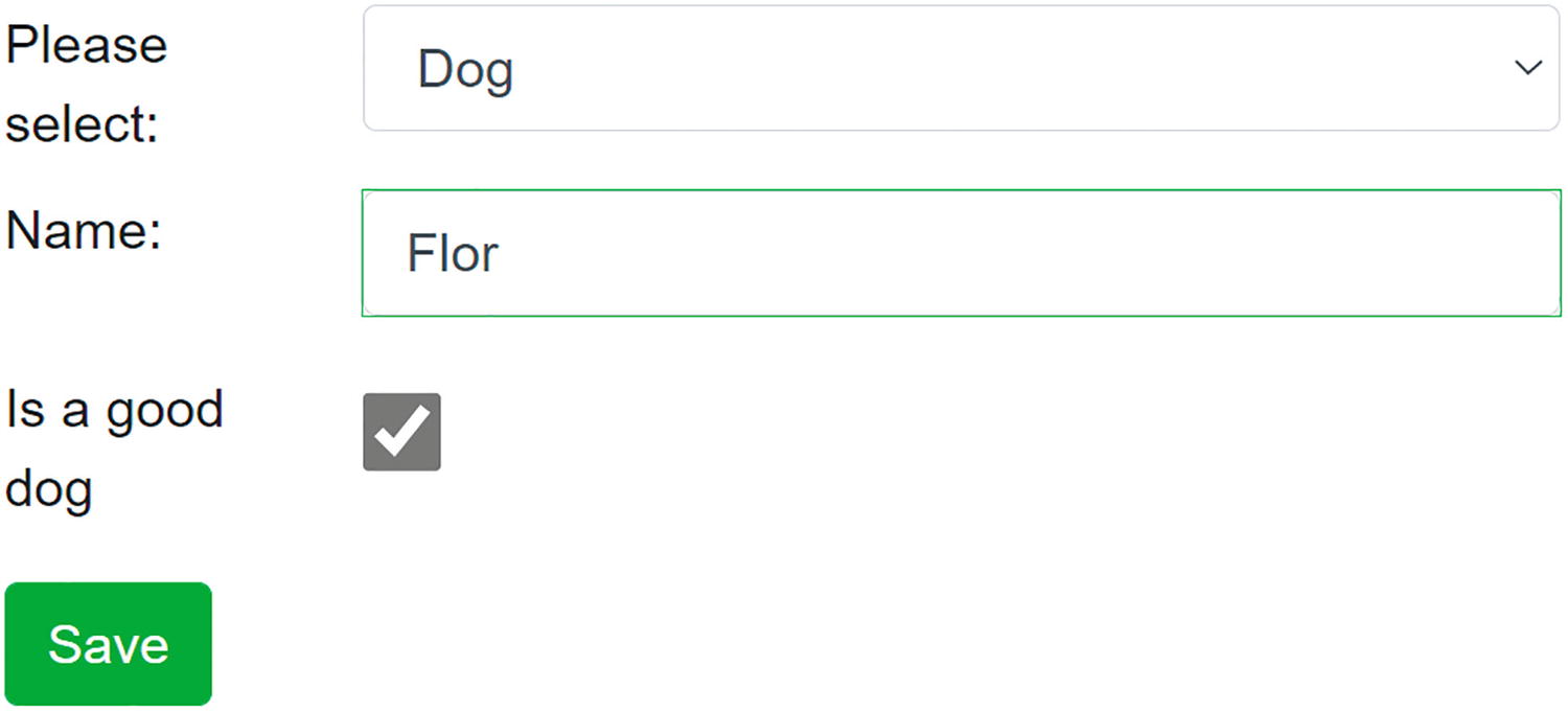
Run the application. Now when you select a kind of animal, the appropriate editor is shown as in Figure 4-4.
Figure 4-4
The AnimalSelector After Selecting a Dog
Component Reuse and PizzaPlace
In Chapter 3, we built a couple of components for the PizzaPlace application. There was an opportunity to have more reuse, and we are going to take that here. We will build a templated component for showing lists of pizza and then reuse it to show the menu and the shopping basket. Open the PizzaPlace solution from the previous chapter (or the sources that come with this book).
Let’s first refresh out memory. We have a PizzaItem component to show the details of a Pizza. We also have the PizzaList component that shows the pizzas from the menu, and we have the ShoppingBasket component to list the pizzas from the order. Both PizzaList and ShoppingBasket iterate over a list, so there is an opportunity here for reuse. Create a new component called ItemList from Listings 4-44 and 4-45. Here, we have a Header and Footer of type RenderFragment? and a RowTemplate parameter of type RenderFragment<TItem>. The Header and Footer parameters are optional, and that is why we use an @if. There is also the Items parameter of type IEnumerable<TItem>, and this parameter allows the compiler to infer the type of TItem when we assign it a collection. We iterate over this parameter using a @foreach, and we call the RowTemplate RenderFragment.
using Microsoft.AspNetCore.Components;
using System.Collections.Generic;
namespace PizzaPlace.Client.Pages
{
public partial class ItemList<TItem>
{
[Parameter]
public RenderFragment? Header { get; set; }
[Parameter]
public RenderFragment<TItem> RowTemplate { get; set; } = default!;
[Parameter]
public RenderFragment? Footer { get; set; }
[Parameter]
public IEnumerable<TItem> Items { get; set; } = default!;
}
}
Listing 4-44
The ItemList Component’s Code
@typeparam TItem
@if (Header is not null)
{
@Header
}
@foreach (TItem item in Items)
{
@RowTemplate(item)
}
@if (Footer is not null)
{
@Footer
}
Listing 4-45
The ItemList Component’s Markup
Now that we have this templated component, we can use it for both the PizzaList and ShoppingBasket components.
Update the markup for the PizzaList component as in Listing 4-46.
<ItemList Items="@Items">
<Header>
<h1>@Title</h1>
</Header>
<RowTemplate Context="pizza">
<PizzaItem Pizza="@pizza"
ButtonClass="@ButtonClass"
ButtonTitle="@ButtonTitle"
Selected="@Selected" />
</RowTemplate>
</ItemList>
Listing 4-46
The PizzaList Component Using the ItemList
And replace the ShoppingBasket markup with Listing 4-47.
@if (Pizzas.Any())
{
<ItemList Items="@Pizzas">
<Header>
<h1 class="">Your current order</h1>
</Header>
<RowTemplate Context="tuple">
<PizzaItem Pizza="@tuple.pizza"
ButtonClass="btn btn-danger"
ButtonTitle="Remove"
Selected="@(() =>
Selected.InvokeAsync(tuple.pos))" />
</RowTemplate>
<Footer>
<div class="row">
<div class="col"></div>
<div class="col"><hr /></div>
<div class="col"> </div>
<div class="col"> </div>
</div>
<div class="row">
<div class="col"> Total:</div>
<div class="col text-right font-weight-bold">
@($"{TotalPrice:0.00}")
</div>
<div class="col"> </div>
<div class="col"> </div>
<div class="col"> </div>
</div>
</Footer>
</ItemList>
}
Listing 4-47
The ShoppingBasket Component Using the ItemList
Now we have enhanced our PizzaPlace application by adding a templated component which we reuse for both the PizzaList and ShoppingBasket components. Compile and run. The PizzaPlace application should work as before.
Summary
In this chapter, we saw that in Blazor you can build templated components, which resemble generic classes. These templated components can be parameterized to render different UIs, which makes them quite reusable! We discussed Razor templates, which allows us to write markup in C# and had a look at the weird pig-wig syntax. We can build component libraries to maximize reuse of our components. Finally, we looked at virtualization which is a great way to work with large lists and how dynamic components give flexibility at runtime.
We applied this knowledge by building a simple templated component for showing lists of pizzas which we need in several places.