In the previous chapter on data binding, you have built a single monolithic application called PizzaPlace with Blazor. After a while, this will become harder and harder to maintain because everything is in one place, resulting in one big razor file.
In modern web development, we build applications by constructing them from components, which typically are again built from smaller components. A Blazor component is a self-contained chunk of user interface. Blazor components are classes built from razor and C# with one specific purpose (also known as single responsibility principle ) and are easier to understand, debug, and maintain. And of course, you can reuse the same component in different pages, which can be a huge advantage.
In this chapter, we will explore how to build Blazor components.
What Is a Blazor Component?
To put it in a simple manner, each razor file in Blazor is a component. It’s that simple! A razor file in Blazor contains markup and has code in the @code section. Each page we have been using from the MyFirstBlazor project is a component! And components can be built by adding other components as children.
Any class that derives from the ComponentBase class becomes a Blazor component; a little later, we will build an example of this. When you use a razor file, the generated class will also derive from ComponentBase.
Remember the MyFirstBlazor project from the previous chapter? Create a new one just like it in Visual Studio (or Code), and let’s have a look at some of the components in there.
The Index Page
Examining the SurveyPrompt Component
The SurveyPrompt Component
 – this will show Microsoft that you’re interested in Blazor).
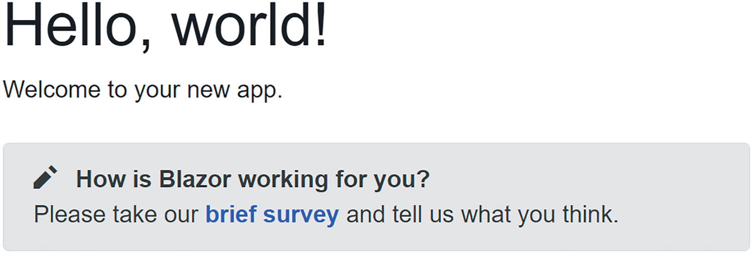
The SurveyPrompt Component
The @code section simply contains a property Title that uses one-way data binding for rendering in the component. Do note the [Parameter] attribute on the Title property. This is required for components that want to expose their public properties to the parent component. This way, we can pass data to nested components, for example, how the Index component passes the Title to the SurveyPrompt component.
Building a Simple Alert Component with Razor
Let us build our own Blazor component that will show a simple alert. Alerts are used to draw the attention of the user to some message, for example, a warning.
Creating a New Component with Visual Studio
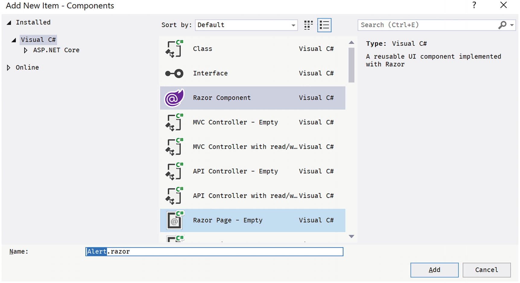
The Add New Item Window
Select Razor Component and name it Alert.razor. Click Add.
Creating a New Component with Code
Right-click the Pages folder of the client project and select New File. Name it Alert.razor. Unlike Visual Studio, this will not generate any code in this file. There are extensions available for creating Blazor components. I will let you explore which one you like best (e.g., https://visualstudiomagazine.com/articles/2020/04/08/vs-code-blazor.aspx).
Implementing the Alert Component
Remove all existing content from Alert.razor and replace it with Listing 3-3. Let us have a look at this component.
The first line in the Alert component uses an @if to hide or show its inner content. This is a common technique if you want to conditionally display content. So, if the Show public property (actually parameter) is false, the whole component is not shown. This allows us to “hide” the component until needed.
Our Alert component will show some content in a <div> element as an alert (using bootstrap styles), so how do we pass this content to the Alert component? Inside the @if, there is a <div> element with @ChildContent as its child. You use @ChildContent if you want to access the nested element in the Alert component, as you’ll see when we use the Alert component in Listing 3-4.
The Alert Component
The default Blazor templates use Bootstrap 4 for styling. Bootstrap (http://getbootstrap.com) is a very popular CSS framework, originally built for Twitter, giving an easy layout for web pages. However, Blazor does not require you to use bootstrap, so you can use whatever styling you prefer. In that case, you would have to update all the razor files in the solution using the other styles, just like in regular web development. In this book, we will use bootstrap, simply because it is there.
Go back to Index.razor to add the element.
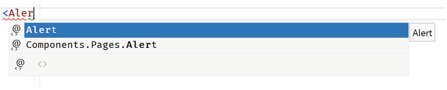
Visual Studio IntelliSense Support for Custom Blazor Components
Using Our Alert Component in Index.razor
Inside the <Alert> tag, there is a <span> displaying a checkmark icon using the open-iconic font and a <strong> element displaying a simple message. These will be set as the @ChildContent property of the Alert component.
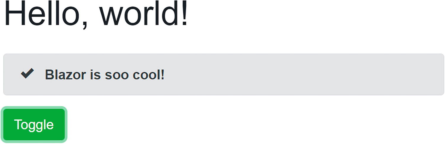
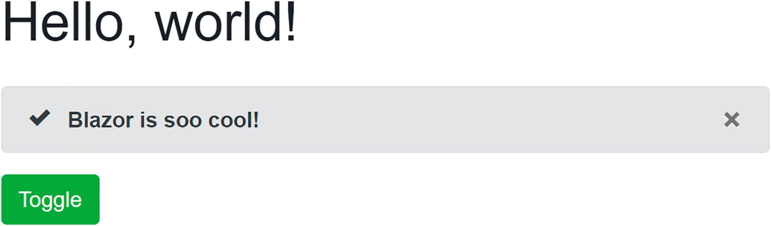
Our Simple Alert Component Before Clicking the Toggle Button
Separating View and View Model
You might not like this mixing of markup (view) and code (view model). If you like, you can use two separate files, one for the view using razor and another for the view model using C#. The view will display the data from the view model, and event handlers in the view will invoke methods from the view model.
Some people prefer this way of working because it’s more like the MVVM pattern.
Each Blazor razor file gets generated into a C# partial class. If you want to separate the code from the razor file, put the code in a partial class with the same name as the component. The C# compiler will merge code from both files into a single class. Let’s try this!
Creating a DismissibleAlert Component
If you haven’t done so yet, open the MyFirstBlazor solution. With Visual Studio, right-click the Pages folder and select Add ➤ New Item…. The Add New Item dialog should open as shown in Figure 3-2. This time, select Razor Component and name it DismissibleAlert.razor. Also, add a new C# class, and call the file DismissibleAlert.razor.cs.
With Visual Studio Code, right-click the Pages folder, select New File, and name it DismissibleAlert.razor. Do this again to create a new file called Dismissible.razor.cs.
The Markup for Dismissible.razor
There is no @code section, because you will write this in the .cs file.
The Code for Dismissible.razor.cs
Do note that this is a partial class with the same name as the Blazor component! So instead of putting your code in the @code section of a razor file, you can put the code in a partial class.
Which model is best? I don’t think either one is better than the other; it is more a matter of taste. Choose the one you like. I do like the code separation model a little more (my personal opinion) because I think the C# editor has better features for keeping my code maintainable and clean.
Understanding Parent-Child Communication
Using Dismissible
Adding a Timer Component
Start by adding a new class called Timer to the Pages folder as shown in Listing 3-8. The timer will not have any visual part, so we don’t even need a .razor file to build the view.
A Blazor component is a class that inherits the ComponentBase class. Since we want to use the Timer class as a Blazor component, we need to inherit from ComponentBase .
The Timer Class
Adding the Timer Component to Dismiss the Alert
Run the application and wait at least 5 seconds. The alert does not hide! Why?!
Look at the markup, which is in Listing 3-9, for Dismissible. It shows the component based on the Show parameter, and this one gets set through data binding. Does the ToggleAlert method get called? Run the Blazor website again, and immediately open the browser’s debugger on the console tab. After a little while, you should see the Console.WriteLine output appear. So the ToggleAlert method does get called.
Think about this. We invoke a method asynchronously using a Timer. When the timer fires, we set the Index component ShowAlert property to false. But we still need to update the UI. You can manually trigger the UI to update by calling the StateHasChanged method .
This is very important! The Blazor runtime updates the UI automatically when an event triggers, like the button click. The Blazor runtime also updates the UI for its own asynchronous methods, but not for other asynchronous methods like Timer.
Adding StateHasChanged
Run again and wait, and after 5 seconds, the alert disappears!
To be honest, I don’t like the previous solution to our problem. Because a child component calls the ToggleAlert method , we manually need to call StateHasChanged . Is there no better way? And we haven’t even solved another problem. When the user dismissed the alert before the timer triggered the Tick method, it should reappear after 5 seconds because it will set ShowAlert back to true!
We will fix both problems, but first, we need to understand two-way data binding between components.
Using Two-Way Data Binding Between Components
When the user clicks the Dismissible component’s close button, it sets its own Show property to false, as intended. The problem is that the parent Index component’s ShowAlert stays true. Changing the value of the Dismissible local Show property will not update the Index component’s ShowAlert property. What we need is two-way data binding between components, and Blazor has that.
With two-way data binding, changing the value of the Show parameter will update the value of the ShowAlert property of the parent and vice versa.
Using Two-Way Data Binding
Properties that support two-way data binding need a way to tell the parent that the property has changed. The child component uses for that a delegate, so the parent component through the Blazor runtime can install its own change handler (just like an event) when the property has changed. This change handler will then update the parent component’s data bound property. The child component is responsible for invoking the Changed delegate when the property changes.
Open the Dismissible class and its implementation to match Listing 3-12. There are two changes. First of all, the Show property now uses the “full” implementation of a property, because we need to implement the setter that it will call the ShowChanged delegate when its value changes.
The Dismissible Class with Two-Way Binding Support
Whenever someone or something changes the Show property’s value, the property’s setter triggers the ShowChanged delegate. This means the parent component can inject some code (which it does for you when you use two-way data binding) into the ShowChanged delegate property which will invoke when the property is changed (internally or externally).
The property setter checks if the value has changed. Only trigger the Changed delegate when there is an actual change. This will avoid a possible endless loop of Changed handling.
Now, when the Dismissible Show property changes, Blazor will update the parent's ShowAlert property because we are using two-way data binding.
We still need to fix the problem when the Timer fires.
Update the UI when ShowAlert Changes the Value
Run. Wait 5 seconds.
The Alert Being Shown

The Alert Automatically Hides After 5 Seconds
Should your project still not update, you can debug a client-side Blazor project by adding breakpoints or some Console.WriteLine statements. These will appear in the browser’s console window. You can see examples of this in the book’s code which you can download from the Apress site.
Using EventCallback<T>
Now, with the DismissibleAlert component from the previous section, we have been using two-way data binding between components with the @bind-Show syntax, and we used the ShowChanged callback to notify the parent component that the Show property has changed. To make the parent update its UI, we also added a call to StateHasChanged when the parent’s ShowAlert property gets modified. But there is a better way!
Blazor has the EventCallback type for this, which was added to Blazor in .NET Core 3.0 Preview 3 (https://github.com/aspnet/AspNetCore/issues/6351). The big difference between Action<T> and EventCallback<T> is that the latter will invoke StateHasChanged for you!
Using EventCallback<T>
So instead of using an Action<T> delegate, we use the EventCallback<T> type. First of all, this type is a value type, so we don’t need to check for null. And instead of an Invoke method, it has an InvokeAsync method which solves some special problems which are not important at this point in time.
If you want to learn more about these problems, open your browser on https://github.com/dotnet/aspnetcore/issues/6351.
The Improved Timer Component
Index with Simple ShowAlert Property
Build and run. Wait 5 seconds. The alert should hide!
In general, you should prefer EventCallback<T> over normal delegates for parent-child communication, such as events and two-way data binding. There are exceptions to the rule (e.g., the fact that EventCallback triggers component, re-rendering might be a problem, and then using a delegate can be the solution).
Referring to a Child Component
Generally, you should prefer data binding to have components communicate with one another. This way, one component does not need to know anything about another component, except the data bindings. It also makes the Blazor runtime take care of updating components with changes.
Referring to a Child Component
In this example, the Blazor runtime will put a reference to the DismissibleAlert component in the alert field. You can instruct Blazor to do this using the @ref syntax. When the timer calls its Tick parameter after 5 seconds, we use this reference to call the DismissibleAlert’s Dismiss method.
Communicating with Cascading Parameters
When a higher-level component wants to pass data to an immediate child, life is easy. Simply use data binding. But when a higher-level component needs to share some data with a deeper nested component, passing data using data binding requires each intermediate component to expose that data through a parameter and pass it down to the next level. Not only is this inconvenient when you have several levels of components, but who says that you are in control of these components? Blazor solves this problem with cascading values and parameters. Let us look at an example.
The CounterData Class
Using the CascadingValue Component
Use the CascadingValue Component to Pass Data to Descendants
Using the GrandMother Component
Receiving the Cascading Value
When you click the Inc button of GrandChild, the CounterData’s Count property increments. The GrandMother component wants to display this value every time it gets incremented, so CounterData notifies the GrandMother of changes. The GrandMother component subscribes to these changes and calls StateHasChanged to update itself. How the shared object handles this notification is up to you; for example, CounterData uses a delegate. You could also use INotifyPropertyChanged . If you’re not familiar with this interface, it is used in a lot of .NET applications to notify interested parties that a property has changed. For example, Windows Presentation Foundation (WPF) heavily relies on this interface. If you would like to learn more, any good book on WPF will explain this, or you can find more information at https://docs.microsoft.com/dotnet/api/system.componentmodel.inotifypropertychanged.
Resolving Ambiguities
Use a Named Cascading Value in GrandMother
Receive the Named Cascading Value
Component Life Cycle Hooks
A Blazor component has a life cycle just like any other .NET object. A component is born, goes through a couple of changes, and then dies. A Blazor component has a couple of methods you can override to capture the life cycle of the component. In this section, we will look at these life cycle hooks because it's very important to understand them well. Putting code in the wrong life cycle hook will likely break your component.
You should also remember that each life cycle method gets called at least once for every component. Even a component with no parameters will see methods like SetParametersAsync and OnParametersSetAsync called at least once.
Life Cycle Overview
The LifeCycle Component’s Code
The LifeCycle Component’s Markup
Using the LifeCycle Component
The LifeCycle component gets constructed (constructor called), and then Blazor calls the SetParametersAsync method . This method normally will result in the parameter setters being called, and that is why we see the Counter property’s output.
Then the Blazor runtime calls the OnInitialized method (and the asynchronous OnInitializedAsync which I left out for simplicity). After this, the OnParametersSet method is called (and also the asynchronous OnParametersSetAsync method). Now the component is ready to be rendered, and the Blazor runtime renders it. Finally, rendering the OnAfterRender method is called which gets passed a Boolean which is true on the first render.
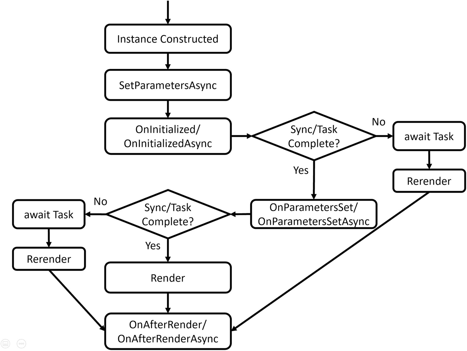
Because I clicked the Increment button of the Index component, it invokes the click handler and then re-renders itself. But first it sets the parameters on the LifeCycle component which results in the SetParametersAsync method being called again (which sets the Counter parameter). After this, it invokes the OnParametersSet method to indicate all parameters have been updated (and also the asynchronous OnParametersSetAsync method).
Now, should the Blazor runtime render the component? For this, it calls the ShouldRender method , and if this returns true, it will render the LifeCycle component (and then the OnAfterRender method).
Clicking the Increment button results in that sequence again.
Now let us look at each of these methods individually.
SetParametersAsync
If you need to execute some code before the parameters are set, you can override the SetParametersAsync method . The default implementation of the SetParametersAsync method will set each [Parameter] and [CascadingParameter] that has a value in the ParameterView argument. Other parameters (that don’t have a value in ParameterView) are left unchanged.
You can find the parameters in the ParameterView argument which behaves like a dictionary. Let’s look at an example in Listing 3-27. This example uses the SetParametersAsync method to inspect the parameters, looking for a “Counter” parameter. If this parameter is even, we call the base method; otherwise, we don’t do anything, resulting in an even valued Counter.
There is one snag; when you don’t call the base method, the UI doesn’t update, so you should call StateHasChanged if you want the component to update. Initially, our LifeCycle component could receive an odd value, and that is why we call StateHasChanged for the first time.
Overriding SetParametersAsync
OnInitialized and OnInitializedAsync
When your component has been created and the parameters have been set, the OnInitialized and OnInitializedAsync methods are called. Implement one of these methods if you want to do some one-time extra initialization after the component has been created, for example, fetching some data from a server like the FetchData component from the project. The OnInitialized methods are only called once, right after the creation of the component.
The OnInitialized Life Cycle Hook
The OnInitializedAsync Life Cycle Hook
OnParametersSet and OnParametersSetAsync
When you need one or more parameters to look up data after a change to the parameters, you use OnParametersSet or OnParametersSetAsync instead of the OnInitialized/OnInitializedAsync methods. Every time data binding updates one or more of your parameters, these methods get called again, so they are ideal for calculated properties, filtering, etc. For example, you could have a DepartmentSelector component that allows the user to select a department from a company and another EmployeeList component that takes the selected department as a parameter. The EmployeeList component can then fetch the employees for that department in its OnParametersSetAsync method.
The OnParametersSet Method
The OnParametersSetAsync Method
ShouldRender
The ShouldRender method returns a Boolean value, indicating if the component should be re-rendered. Do realize that the first render ignores this ShouldRender method, so a component will render at least once. The default implementation always returns true. You want to override this method to stop the component from re-rendering.
Implementing the ShouldRender Method
OnAfterRender and OnAfterRenderAsync
The OnAfterRender and OnAfterRenderAsync methods are called after Blazor has completely rendered the component. This means that the browser’s DOM has been updated with changes made to your Blazor component. Use these methods to invoke JavaScript code that needs access to elements from the DOM (which we will cover in the JavaScript chapter 10 ). This method takes a Boolean firstRender argument, which allows you to attach JavaScript event handlers only once.
Avoid calling StateHasChanged in this method, as it can cause an infinite loop.
The OnAfterRender Life Cycle Hook
The OnAfterRenderAsync Life Cycle Hook
IDisposable
If you need to run some cleanup code when your component is removed from the UI, implement the IDisposable interface. You can implement this interface in razor using the @implements syntax, for example, in Listing 3-25. Normally, you put the @implements at the top of the .razor file, but if you use code separation, you can also declare it on the partial class.
Most of the time, dependency injection will take care of calling Dispose, so generally, you won’t need to implement IDisposable if you only need to dispose of your dependencies.
Implementing the Dispose Method
A Word on Asynchronous Methods
When the Blazor runtime calls asynchronous methods like OnInitializedAsync and OnParametersSetAsync, it will await this method and will also render the component. The only exception to this is the OnAfterRenderAsync method, which will not trigger a render (otherwise, this will cause an infinite render loop).
Initializing forecasts
Checking forecasts for Null
Refactoring PizzaPlace into Components
In the previous chapter on data binding, we built a website for ordering pizzas. This used only one component with three different sections. Let us split up this component into smaller, easier to understand components and try to maximize reuse.
Creating a Component to Display a List of Pizzas
Open the PizzaPlace Blazor project from the previous chapter. You can also start with the code examples from this book; look for Chapter 2 which contains the finished version. Start by reviewing Index.razor. This is our main component, and you can say that it has three main sections: a menu, a shopping basket, and customer information.
The menu iterates over the list of pizzas and displays each one with a button to order. The shopping basket also displays a list of pizzas (but now from the shopping basket) with a button to remove it from the order. Looks like both have something in common; they need to display pizzas with an action you choose by clicking the button. So let’s create a component to display a list of pizzas, using a nested component to display a pizza’s details.
We have also seen that we can split components into a razor file with the markup and a C# file with the code. Let us do that here!
The Code for the PizzaItem Component
The PizzaItem Component
The PizzaItem component will display a pizza, so it should not come as a surprise that it has a Pizza parameter. This component also displays a button, but how this button looks and behaves will differ where we use it. And that is why it has a ButtonTitle and ButtonClass parameter to change the button’s look, and it also has a Selected event callback of type EventCallback<Pizza> which gets invoked when you click the button. Do you remember why we are using EventCallback<T> instead of Action<T>? Do note that this component does one thing well, and only one thing: display the pizza and allow an action on the pizza by clicking the button.
The PizzaList Component’s Code
The PizzaList Component’s Markup
First note the use of the @if. Here, we need to decide what to do should the Items property (which is an IEnumerable<Pizza>) be null of empty. In that case, we will display a loading UI, assuming the Items collection will be filled in later.
Otherwise, the PizzaList component displays a Title and all the pizzas from the Items collection, so it takes these as parameters. It also takes a Selected event callback which you invoke by clicking the button next to a pizza. Note that the PizzaList component reuses the PizzaItem component to display each pizza and that the PizzaList Selected event callback is passed directly to the PizzaItem Selected event callback. Same thing for the button parameters. The Index component will set this callback, and it will be executed by the PizzaItem component.
Using the PizzaList Component in Index.razor
Run the application and try to order a pizza. Your selected pizza should be added to the shopping basket. Thanks to the EventCallback<T> type, there is no need to call StateHasChanged. Had we used an Action<T> or Func<T>, the UI would not update, and you would need to call StateHasChanged whenever you receive events from a child component!
Showing the ShoppingBasket Component
The ShoppingBasket Component’s Code
The ShoppingBasket Component’s Markup
The ShoppingBasket component is similar to the PizzaList component , but there are some big differences (and that is why we are not reusing the PizzaList component. We will do this in the next chapter). The ShoppingBasket class (the one from the shared project) keeps track of the order using only ids of pizzas, so we need something to get the pizza object. This is done through the GetPizzaFromId delegate (again, we don’t want this component to know a lot about the other classes). Another change is the OnParametersSet method. The OnParametersSet method gets called when the component’s parameters have been set. Here, we override it to build a list of (pizza, position) tuples which we need during data binding and to calculate the total price of the order.
Tuples are just another type in C#. But with modern C#, we get this very convenient syntax; for example, IEnumerable<(Pizza pizza, int pos)> means we have a type that is a list of pizza and position pairs. Think of tuples as a nice replacement for anonymous types, which allow you to quickly have compiler-generated types.
Using the ShoppingBasket Component
Run your project again. Everything should still work (and look the same).
Adding the CustomerEntry Component
The CustomerEntry Component’s Code
The CustomerEntry Component’s Markup
The CustomerEntry component uses a <label>, InputText, and ValidationMessage for each customer property.
The Index Component
Build and run the PizzaPlace application. Things should work like before, except for one thing. Remember the debugging tip from the previous chapter? When you change the name of the customer, this tip does not update correctly. Only after pressing the button will this update. Let’s fix this.
Using Cascading Properties
The problem is as follows. Whenever the user edits properties from the customer, we want the CustomerEntry component to trigger a CustomerChanged event callback. This way, other components in the UI will update because of changes to the customer. But how can we detect these changes? If we were using <input> elements, we could use the onchanged event, but unfortunately, the InputText component does not have this event. It does have the ValueChanged event, but I don’t want to use that here (otherwise, I could not show you the use of a cascading property for this).
Look at the CustomerEntry component again. You see an EditForm with nested InputText components. The EditForm provides a cascading value of type EditContext, and the InputText components use this EditContext for things like validation.
If you like, all of the source code for the InputText and other components in Blazor is available on GitHub (https://github.com/dotnet/aspnetcore/tree/master/src/Components) since Blazor is open source. That is what I did to figure out the solution to the problem.
Whenever one of the Input components changes, it calls the EditContext.NotifyFieldChanged method . And here is where things get interesting because EditContext has an OnFieldChanged event, which triggers every time a model’s property changes.
Let us build a component that uses the EditContext’s OnFieldChanged event to notify us of changes. This way, we don’t have to implement the ValueChanged event for each Input.
The InputWatcher Component
When the EditContext property gets set, the InputWatcher simply registers for the FieldChanged event and calls its own FieldChanged event callback.
Make the Customer Parameter Two-Way Bindable
The CustomerEntry Component with CustomerChanged Callback
Use Two-Way Data Binding for the Customer
Build and run. When you make a change to the customer, you should see the customer update in the debugging tip when you tab out of a control. Hey, this was not hard at all!
Disabling the Submit Button
You might want to disable the Submit button as long as there are validation errors. Our freshly introduced InputWatcher allows us to do that. Look for the Validate method in Listing 3-49. This method calls the EditContext.Validate method. We are going to use this to enable/disable the Submit button.
Disabling the Submit Button
Disabling the Submit Button
Run your application, and leave some of the Customer properties invalid (that is to say blank). When you press the Submit button (a.k.a. Checkout), you will get validation errors and the button will disable itself. When you fix the validation errors, the Submit button will again be enabled. If you want the button to be enabled right away, change the initial value of isInvalid to false.
Summary
In this chapter, we covered building Blazor components. We discussed how components can communicate with each other through parameters and data binding. We look at how a component can reference a child component. Cascading values are a very nice way of sharing data between components in a hierarchy. Finally, we saw the life cycle hooks that Blazor components have and allow us to intercept the important events in a component’s life.
We applied this by dividing the monolithic Index component of the PizzaPlace application into smaller components.