Imagine an application that needs to display data to the user, and capture changes made by that user to save the modified data. One way you could build an application like this is to, once you got the data, iterate over each item of data. For example, for every member of a list, you would generate the same repeating element, and then inside that element, you would generate text boxes, drop-downs, and other UI elements that present data. Later, after the user has made some changes, you would iterate over your generated elements, and for every element, you would inspect the child elements to see if their data was changed. If so, you copy the data back into your objects that will be used for saving that data.
This is an error-prone process and a lot of work if you want to do this with something like jQuery (jQuery is a very popular JavaScript framework which allows you to manipulate the browser’s Document Object Model (DOM)).
Modern frameworks like Angular and React have become popular because they simplify this process greatly through data binding. With data binding, most of this work for generating UI and copying data back into objects is done by the framework.
A Quick Look at Razor
Blazor is the combination of Browser + Razor (with a lot of artistic freedom). So, to understand Blazor, we need to understand browsers and the Razor language. I will assume you understand what a browser is since the Internet has been very popular for over more than a few decades. But Razor (as a computer language) might not be that clear (yet). Razor is a markup syntax that allows you to embed code in a template. Razor can be used to dynamically generate HTML, but you can also use it to generate code and other formats. For example, at the company I work, we generate emails using Razor.
Razor made its appearance in ASP.NET MVC. In ASP.NET Core MVC, razor is executed at the server side to generate HTML which is sent to the browser. But in Blazor, this code is executed inside your browser (with Blazor WebAssembly) and will dynamically update the web page without having to go back to the server.
Remember the MyFirstBlazor solution we generated from the template in the previous chapter? Open it again with Visual Studio or Code and have a look at SurveyPrompt.razor as shown in Listing 2-1.
// Demonstrates how a parent component can supply parameters
[Parameter]
public string Title { get; set; }
}
Listing 2-1
Examining SurveyPrompt.razor
As you can see, razor mainly consists of HTML markup. But if you want to have some C# properties or methods, you can embed them in the @code section of a razor file. This works because the razor file is used to generate a .NET class and everything in @code is embedded in that class.
For example, the SurveyPrompt component allows you to set the Title property, which is set in Index.razor as in Listing 2-2.
<SurveyPrompt Title="How is Blazor working for you?" />
Listing 2-2
Setting the SurveyPrompt’s Title (Excerpt from Index.razor)
Because the public Title property can be set in another component, the property becomes a parameter, and because of that, you need to apply the [Parameter] attribute, as in Listing 2-1. SurveyPrompt can then embed the contents of the Title property in its HTML markup using the @ syntax (third line in Listing 2-1). This syntax tells razor to switch to C#, and this will get the property as an expression and embed its value in the markup.
One-Way Data Binding
One-way data binding is where data flows from the component to the DOM or vice versa, but only in one direction. Data binding from the component to the DOM is where some data, like the customer’s name, needs to be displayed. Data binding from the DOM to the component is where a DOM event took place, like the user clicking a button, and we want some code to run.
One-Way Data Binding Syntax
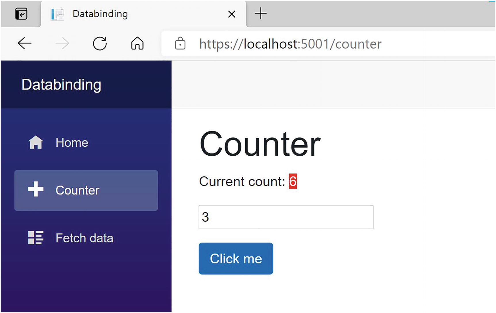
Let’s look at an example of one-way data binding in razor. Open the solution we built in Chapter 1 (MyFirstBlazor.sln), and open Counter.razor, repeated here in Listing 2-3.
On this page, you get a simple counter, which you can increment by clicking the button as illustrated in Figure 2-1.
Figure 2-1
The Counter Page
Let’s look at the workings of this page. The currentCount field is defined in the @code section in Counter.razor. This is not a field that can be set from outside, so there is no need for the [Parameter] attribute, and we can keep it private.
To display the value of the counter in razor, we use the @currentCount razor syntax as shown in Listing 2-4.
<p>Current count: @currentCount</p>
Listing 2-4
Data Binding from the Component to the DOM
Any time you click the button, the Blazor runtime sees that currentCount may have been updated, and it will automatically update the DOM with the latest value of currentCount.
Attribute Binding
You can also use this same syntax to bind the value of an HTML attribute.
Open app.css which you can find in the wwwroot/css folder and add these two CSS classes from Listing 2-5.
.red-background {
background: red;
color: white;
}
.yellow-background {
background: yellow;
color: black;
}
Listing 2-5
Some Simple Styles
Wrap the currentCount in an <span> as in Listing 2-6. Every time you change the value of currentCount by clicking the button, it changes the currentCount’s background color.
Sometimes you can control the browser by adding some attributes to DOM elements. For example, in Listing 2-7, to disable a button, you can simply use the disabled attribute.
<button disabled>Disabled Button</button>
Listing 2-7
Disabling a Button Using the disabled Attribute
With Blazor, you can data bind an attribute to a Boolean expression (e.g., a field, property, or method of type bool), and Blazor will hide the attribute if the expression evaluates to false (or null) and will show the attribute if it evaluates to true. Go back to the Counter.razor and add the code from Listing 2-8.
<button class="btn btn-primary"
disabled="@(currentCount > 10)"
@onclick="IncrementCount">
Click me
</button>
Listing 2-8
Disabling the Click Me Button
Try it. Clicking the button until the currentCount becomes 10 will disable the button by adding the disabled attribute to the button. As soon as currentCount falls below 10, the button will become enabled again (except there is no way you can do this for the moment).
Event Handling and Data Binding
We update currentCount using the IncrementCount() method from Listing 2-3. This method gets called by clicking the “Click Me” button. This again is a one-way data binding, but in the other direction, from the button to your component. Blazor allows you to react to DOM events (like the DOM’s click event) this way, instead of using JavaScript. You can also build your own components that have events, where you can use the same syntax to react to them. This will be discussed in Chapter 3.
Event Binding Syntax
Look at Listing 2-9. Now we are using the @on<event> syntax; in this case, we want to bind to the button’s click DOM event, so we use the @onclick attribute on the button element, and we pass it the name of the method we want to call.
Clicking the button will trigger the DOM’s click event, which then will call the IncrementCount method, which will cause the UI to be updated with the new value of the currentCount field. Whenever the user interacts with the site, for example, by clicking a button, Blazor assumes that the event will have some side effect because a method gets called, so it will update the UI with the latest values. Simply calling a method will not cause Blazor to update the UI. We will discuss this later in this chapter.
Event Arguments
In regular .NET, event handlers of type EventHandler can find out more information about the event using the sender and EventArgs arguments. In Blazor, event handlers don’t follow the strict event pattern from .NET, but you can declare the event handler method to take an argument of some type derived from EventArgs, for example, MouseEventArgs, as shown in Listing 2-10. Here, we are using the MouseEventArgs instance to see if the Ctrl key is being pressed and, if so, to decrement the currentCount field.
Data binding to an event does not always require you to write a method. You can also use C# lambda function syntax with an example shown in Listing 2-11.
<button class="btn btn-primary"
disabled="@(currentCount > 10)"
@onclick="@(() => currentCount++)">
Click me
</button>
Listing 2-11
Event Data Binding with Lambda Syntax
If you want to use a lambda function to handle an event, you need to wrap it in round braces.
Two-Way Data Binding
Sometimes you want to display some data to the user, and you want to allow the user to make changes to this data. This is common in data entry forms. Here, we will explore Blazor’s two-way data binding syntax.
Two-Way Data Binding Syntax
With two-way data binding, we will have the DOM update whenever the component changes, but the component will also update because of modifications in the DOM. The simplest example is with an <input> HTML element.
Let’s try something. Modify Counter.razor by adding an increment field and an <input> element using the @bind attribute as shown in Listing 2-12. Also modify the IncrementCount method to use the increment when you click the button.
Change the value of the input, for example, 3. You should now be able to increment the currentCount with other values as in Figure 2-2.
Figure 2-2
Adding an Increment with Two-Way Data Binding
Look at the <input> element you just added, repeated here in Listing 2-13.
<input type="number" @bind="@increment" />
Listing 2-13
Two-Way Data Binding with the @bind Syntax
Here, we are using the @bind syntax which is the equivalent of two different one-way bindings as shown in Listing 2-14.
Here, we use one-way data binding (value="@increment") to set the input’s value property to the increment variable. When the user modifies the contents of the input element, the change event (@onchange) will trigger and will set the increment variable to the input’s value (increment = int.Parse($"{e.Value}")). So when one side changes, the other will be updated.
<input type="number"
value="@increment"
@onchange="@((ChangeEventArgs e)
=> increment = int.Parse($"{e.Value}"))" />
Listing 2-14
Data Binding in Both Directions
This alternative syntax is very verbose and not that handy to use. Using @bind is way more practical. However, don’t forget about this technique; using the more verbose syntax can sometimes be a more elegant solution!
Binding to Other Events: @bind:{event}
Blazor will update the value in two-way data binding when the DOM’s onchange event occurs. This means that the increment field of the Counter component will be updated when the user changes the focus to another element, for example, the button. But maybe this is too late for you. Let’s look at how you can change the event that triggers data binding.
Add a second input by copying the line from Listing 2-14. Run this example and change the value of one input by typing a number into it (don’t use the increment/decrement buttons that browsers add for number inputs). The other input’s value will not update immediately. Clicking the other input will update it. This is because we’re using the onchange event, which triggers when the input loses focus! If you want data binding to occur immediately, you can bind to the oninput event by using the explicit @bind:event syntax. The oninput event triggers after each change in the input. Update the second input element to match Listing 2-15. Typing in the second input will update the first input after each keystroke.
In Blazor, you can react to events, and the browser will also react to these. For example, when you press a key with the focus on an <input> element, the browser will react by adding the keystroke to the <input>.
But what if you don’t want the browser to behave as normal? Let’s say you want to allow the user to increment and decrement an input’s value simply by pressing “+” or “-”. Change the <input> from Listing 2-12 to react to the keypress event as in Listings 2-16 and 2-17.
<p>
<input type="number"
@bind="@increment"
@onkeypress="KeyHandler" />
</p>
Listing 2-16
Handling keypress Events
private void KeyHandler(KeyboardEventArgs e)
{
if (e.Key == "+")
{
increment += 1;
}
else if (e.Key == "-")
{
increment -= 1;
}
}
Listing 2-17
The KeyHandler Method
Build and run. Pressing “+” and “-” will increment and decrement the value in the input, but you will also see any key you just pressed added to the <input> HTML element because this is the default behavior for an input. To stop this default behavior, we can add @{event}:preventDefault like in Listing 2-18. Here, we use a bool field shouldPreventDefault (set to true) to stop the default behavior of the input, but you can use any Boolean expression.
Build and run again. Now pressing “+” will increment the input’s value as expected.
You can also leave out the value for preventDefault, and then it will always prevent the default action as in Listing 2-19.
<p>
<input type="number"
@bind="@increment"
@onkeypress="KeyHandler"
@onkeypress:preventDefault />
</p>
Listing 2-19
Shorter Notation
Stopping Event Propagation
In a browser, events propagate to the parent element, then to that parent element’s parent, etc. Again, generally this is desirable, but not always.
Let’s look at an example. Start by adding two nested div elements to the Counter component which each handles the @onmousemove event as in Listing 2-20.
Also add code from Listing 2-21. These event handlers simply show the mouse position in the element.
private void KeyHandler(KeyboardEventArgs e)
{
if (e.Key == "+")
{
increment += 1;
}
else if (e.Key == "-")
{
increment -= 1;
}
}
private string outerPos = "Nothing yet";
private void OuterMouseMove(MouseEventArgs e)
=> outerPos = $"Mouse at {e.ClientX}x{e.ClientY}";
private string innerPos = "Nothing yet";
private void InnerMouseMove(MouseEventArgs e)
=> innerPos = $"Mouse at {e.ClientX}x{e.ClientY}";
Listing 2-21
The Event Handlers
Build and run.
Move the mouse pointer around in the yellow square. Now do the same for the green rectangle. However, moving the mouse in the green square also updates the yellow one! This is because the mousemove event (and others) gets sent to the element where the event occurs and also to its parent element all the way up to the root element! If you want to avoid this, you can stop this propagation by adding the {event}:stopPropagation attribute. Add it to the inner square as in Listing 2-22. From now on, moving the mouse in the inner square does not update the outer square.
If you want to be able to turn this on and off from code, assign a bool expression to this attribute, just like preventDefault.
Formatting Dates
Data binding to a DateTime value can be formatted with the @bind:format attribute as shown in Listing 2-23. If you need to format the date depending on the user’s language and culture, keep on reading. This is discussed in Chapter 14.
Currently, DateTime values are the only ones supporting the @bind:format attribute.
Change Detection
The Blazor runtime will update the DOM whenever it thinks changes have been made to your data. One example is when an event executes some of your code, it assumes you’ve modified some values as a side effect and renders the UI. However, Blazor is not always capable of detecting all changes, and in this case, you will have to tell Blazor to apply the changes to the DOM. A typical example is with background threads, so let us look at an example of this.
Open Counter.razor and add another button that will automatically increment the counter when pressed as in Listing 2-24. The AutoIncrement method uses a .NET Timer instance to increment the currentCount every second. A timer instance will run on a background thread, executing the callback delegate at intervals (just like setInterval with JavaScript).
You might find the lambda function argument in the Timer’s constructor a little strange. I use an underscore when I need to name an argument that is not used in the body of the lambda function. Call it anything you want, for example, ignore – it does not matter. I simply like to use underscore because then I don’t have to think of a good name for the argument. C# 7 made this official; it is called discards, and you can find more at https://docs.microsoft.com/dotnet/csharp/discards.
Run this page. Clicking the “Auto Increment” button will start the timer, but the currentCount will not update on the screen. Why? Try clicking the “Increment” button. The currentCount has been updated, so it is a UI problem. If you open the browser’s debugger, you will see in the console tab a ++ appear every second, so the timer works! That’s because I’ve added a Console.Writeline, which sends the output to the debugger’s console. Sometimes an easy way to see if things are working.
Blazor will re-render the page whenever an event occurs. It will also re-render the page in case of asynchronous operations. However, some changes cannot be detected automatically. In this case, because we are making some changes on a background thread, you need to tell Blazor to update the page by calling the StateHasChanged method which every Blazor component inherits from its base class.
Go back to the AutoIncrement method and add a call to StateHasChanged as in Listing 2-25. StateHasChanged tells Blazor that some state has changed (who would have thought!) and that it needs to re-render the page.
Run again. Now pressing “Auto Increment” will work.
As you can see, sometimes we will need to tell Blazor manually to update the DOM. In general, the Blazor runtime will detect when to update the UI. When the user interacts with your application, events get triggered which will make change detection happen. When an async method completes, change detection will occur. It is only when we go outside the Blazor runtime, for example, using a .NET Timer, that we need to trigger change detection ourselves. More on this when we look at building components in the next two chapters.
The PizzaPlace Single-Page Application
Let us apply this newfound knowledge and build a nice Pizza ordering website. Throughout the rest of this book, we will enhance this site with all kinds of features.
Creating the PizzaPlace Project
Create a new Blazor hosted project, either using Visual Studio or dotnet CLI. Refer to the explanation on creating a project in the first chapter if you don’t recall how. Call the project PizzaPlace. You get a similar project to the MyFirstBlazor project. Now let’s apply some changes!
First, enable the nullable reference type feature for each project (you might find that the Blazor template has already enabled nullable reference types):
<PropertyGroup>
<TargetFramework>net6.0</TargetFramework>
<Nullable>enable</Nullable>
</PropertyGroup>
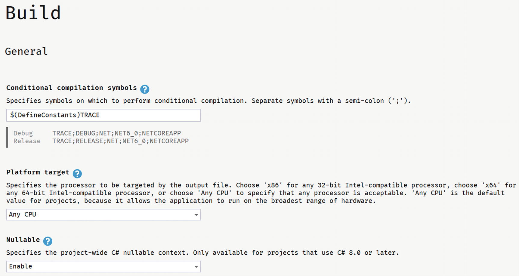
With Visual Studio, you can also open your project’s properties like in Figure 2-3.
Figure 2-3
Enable Nullable Reference Types
Out of the box, Blazor uses the popular Bootstrap 4 layout framework (https://getbootstrap.com/), including open-iconic fonts. Expect to see bootstrap and open-iconic (oi) CSS classes in the code samples. However, you can use any other layout framework, because Blazor uses standard HTML and CSS. This book is about Blazor, not fancy layouts, so we’re not going to spend a lot of time choosing nice colors and making the site look great. Focus!
In the server project, throw away WeatherForecastController.cs. We don’t need weather forecasts to order pizzas. In the shared project, delete WeatherForecast.cs. Same thing. In the client project, throw away the Counter.razor and FetchData.razor files from the Pages folder and SurveyPrompt.razor from the Shared folder.
Adding Shared Classes to Represent the Data
In Blazor, it is best to add classes holding data to the Shared project (unless you are building a Blazor application without a back-end server). These classes are used to send the data from the server to the client and later to send the data back. You might know these kinds of classes as models, or Data Transfer Objects (DTO).
What do we need? Since we will build a site around pizzas, creating a class to represent this makes sense.
Start with classes representing a Pizza and how spicy it is as in Listings 2-26 and 2-27.
namespace PizzaPlace.Shared
{
public enum Spiciness
{
None,
Spicy,
Hot
}
}
Listing 2-26
The Spiciness Class
namespace PizzaPlace.Shared
{
public class Pizza
{
public Pizza(int id, string name, decimal price,
Spiciness spiciness)
{
this.Id = id;
this.Name = name;
this.Price = price;
this.Spiciness = spiciness;
}
public int Id { get; }
public string Name { get; }
public decimal Price { get; }
public Spiciness Spiciness { get; }
}
}
Listing 2-27
The Pizza Class
Our application is NOT about editing pizzas yet, so I’ve made this class immutable, that is, nothing can be changed once a pizza object has been created. In C#, this is easily done by creating properties with only a getter. You can still set these properties, but only in the constructor.
Next, we will need a class representing the menu we offer. Add a new class to the Shared project called Menu with the implementation from Listing 2-28.
As in real life, a restaurant’s menu is a list of meals, in this case, a pizza meal.
We will also need a Customer class in the Shared project with implementation from Listing 2-29. In this case, the Customer class is a normal, mutable class unlike the Pizza class. The user will enter some information which we will store in an instance of Customer. And because we are using nullable reference types, we need to remove the compiler’s warning when we don’t initialize our properties. This is easily done by assigning default! to them. Chapter 1 talks more about this.
namespace PizzaPlace.Shared
{
public class Customer
{
public int Id { get; set; }
public string Name { get; set; } = default!;
public string Street { get; set; } = default!;
public string City { get; set; } = default!;
}
}
Listing 2-29
The Customer Class
Each customer has a shopping basket, so add the Basket class to the Shared project as in Listing 2-30.
using System.Collections.Generic;
namespace PizzaPlace.Shared
{
public class ShoppingBasket
{
public Customer Customer { get; set; } = new Customer();
public List<int> Orders { get; set; } = new List<int>();
public bool HasPaid { get; set; }
}
}
Listing 2-30
The Basket Class, Representing the Customer’s Order
Please note that we just keep the pizza id in the Orders collection. You will learn why later.
One more class before we group them all together. We’ll use a UI class to keep track of some UI options, so add this class to the Shared project as in Listing 2-31.
namespace PizzaPlace.Shared
{
public class UI
{
public bool ShowBasket { get; set; } = true;
}
}
Listing 2-31
The UI Options Class
Finally, we group all these classes into a single State class, again in the Shared project with implementation from Listing 2-32.
namespace PizzaPlace.Shared
{
public class State
{
public Menu Menu { get; } = new Menu();
public ShoppingBasket Basket { get; } = new ShoppingBasket();
public UI UI { get; set; } = new UI();
}
}
Listing 2-32
The State Class
There is another good reason to put all these classes into the Shared project. There is limited debugging for Blazor. By putting these classes into the Shared project, we can apply unit testing best practices on the shared classes because it is a regular .NET project and even use the Visual Studio debugger to examine weird behavior. The Shared project can also be used by other projects since it is a .NET Standard project, for example, a Windows or MAUI client!
Building the UI to Show the Menu
With these classes in place to represent the data, the next step is to build the user interface that shows the menu. We will start by displaying the menu to the user, and then we will enhance the UI to allow the user to order one or more pizzas.
The problem of displaying the menu is twofold: first, you need to display a list of data. The menu can be thought of as a list, like any other list. Secondly, in our application, we’ll need to convert the spiciness choices from their numeric values into URLs leading to the icons used to indicate different levels of hotness.
Open Index.razor. Remove the <SurveyPrompt> element. Add the @code section to hold our restaurant’s (limited) menu with code from Listing 2-33 by initializing the State instance. We also override the OnInitialized method to add our menu items to our State Menu. This method allows you to make some changes to the component before it is rendered for the first time.
@page "/"
<h1>Hello, world!</h1>
Welcome to your new app.
@code {
private State State { get; } = new State();
protected override void OnInitialized()
{
State.Menu.Add(
new Pizza(1, "Pepperoni", 8.99M, Spiciness.Spicy ));
State.Menu.Add(
new Pizza(2, "Margarita", 7.99M, Spiciness.None));
State.Menu.Add(
new Pizza(3, "Diabolo", 9.99M, Spiciness.Hot));
}
}
Listing 2-33
Building Our Application’s Menu
If you compile now, you will get a bunch of compiler errors. These will tell you that the compiler cannot find the class State. What would you do if this was a C# file? You would add a using statement at the top. We can do the same in a razor file, with an example shown in Listing 2-34.
@page "/"
@using PizzaPlace.Shared
<h1>Hello, world!</h1>
Listing 2-34
Adding a using Statement to a Razor Component
However, with razor, we can do even better. We can add this using statement to all the components at once!
Open the _Imports.razor file and add a @using like in Listing 2-35. All razor files in the directory (and child directories) of _Imports.razor will now automatically recognize the PizzaPlace.Shared namespace.
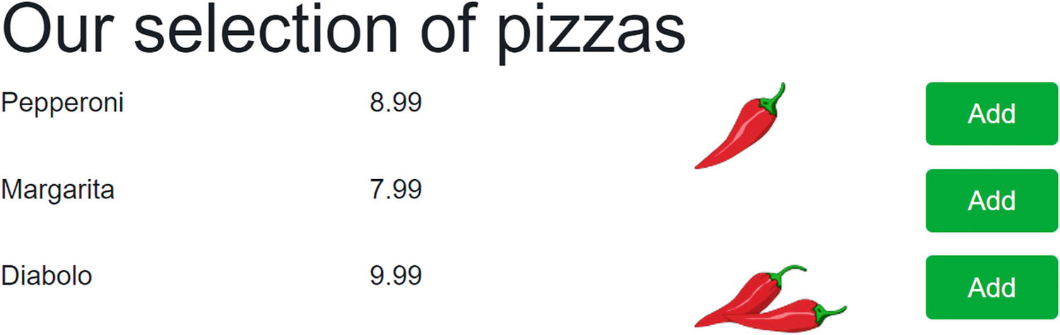
The PizzaPlace menu is a list like any other list. You can display it by adding some razor markup in Index.razor to generate the menu as HTML as shown in Listing 2-36. I like to use comments to show the start and end of each section on my page. This makes it easier to find a certain part of my page when I come back to it later. In the next chapter, we will convert each section in its own Blazor component, making future maintenance a lot easier to do.
What we are doing here is iterating over each pizza in the menu and generate a row with four columns, one for the name, one for the price, one for the spiciness, and finally one for the order button. There are still some compiler errors which we will fix next.
@page "/"
<!-- Menu -->
<h1>Our selection of pizzas</h1>
@foreach (var pizza in State.Menu.Pizzas)
{
<div class="row">
<div class="col">
@pizza.Name
</div>
<div class="col text-right">
@($"{pizza.Price:0.00}")
</div>
<div class="col"></div>
<div class="col">
<img src="@SpicinessImage(pizza.Spiciness)"
alt="@pizza.Spiciness" />
</div>
<div class="col">
<button class="btn btn-success pl-4 pr-4"
@onclick="@(() => AddToBasket(pizza))">
Add
</button>
</div>
</div>
}
<!-- End menu -->
@code {
private State State { get; } = new State();
protected override void OnInitialized()
{
State.Menu.Add(
new Pizza(1, "Pepperoni", 8.99M, Spiciness.Spicy ));
State.Menu.Add(
new Pizza(2, "Margarita", 7.99M, Spiciness.None));
State.Menu.Add(
new Pizza(3, "Diabolo", 9.99M, Spiciness.Hot));
}
}
Listing 2-36
Generating the HTML with Razor
Converting Values
We still have a little problem. We need to convert the spiciness value to an URL, which is done by the SpicinessImage method as shown in Listing 2-37. Add this method to the @code area of the Index.razor file.
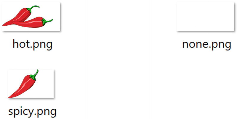
This converter function simply converts the name of the enumeration’s value from Listing 2-26 into the URL of an image file which can be found in the Blazor project’s images folder as shown in Figure 2-4. Add this folder (which can be found in this book’s download) to the wwwroot folder.
Figure 2-4
The Content of the Images Folder
Adding Pizzas to the Shopping Basket
Having the menu functioning leads naturally to the adding of pizzas to the shopping basket. When you click the Add button, the AddToBasket method will be executed with the chosen pizza. You can find the implementation of the AddToBasket method in Listing 2-38 which is part of Index.razor.
@code {
private State State { get; } = new State();
protected override void OnInitialized()
{
State.Menu.Add(
new Pizza(1, "Pepperoni", 8.99M, Spiciness.Spicy ));
State.Menu.Add(
new Pizza(2, "Margarita", 7.99M, Spiciness.None));
Our ShoppingBasket class now needs an Add method as in Listing 2-39.
using System.Collections.Generic;
namespace PizzaPlace.Shared
{
public class ShoppingBasket
{
public Customer Customer { get; set; } = new Customer();
public List<int> Orders { get; set; } = new List<int>();
public bool HasPaid { get; set; }
public void Add(int pizzaId)
=> Orders.Add(pizzaId);
}
}
Listing 2-39
The Basket’s Add Method
Look at the @onclick event handler (@onclick="@(() => AddToBasket(pizza))") for the button from Listing 2-36. Why is this event handler using a lambda? When you order a pizza, you want of course to have your chosen pizza added to the basket. So how can we pass the pizza to AddToBasket from Listing 2-38? By using a lambda function, we can simply pass the pizza variable used in the @foreach loop to it. Using a normal method wouldn’t work because there is no easy way to send the selected pizza. This is also known as a closure (very similar to JavaScript closures) and can be very practical!
When you click the Add button, you’re adding a pizza to the shopping basket. But how can we be sure (since we’re not displaying the shopping basket yet)?
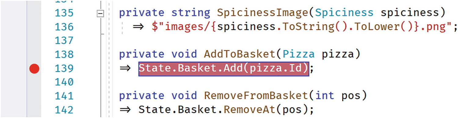
We can use the debugger, just like any other .NET project! Add a breakpoint to the AddToBasket method as in Figure 2-6, and run your project with the debugger. Wait for the browser to display the PizzaPlace page and click one of the Add buttons. The debugger should stop the breakpoint. Now you can inspect the argument of the AddToBasket method, which should be the selected pizza. Most of the usual debugging stuff works with Blazor!
Figure 2-6
Adding a Breakpoint to Your Component
Displaying the Shopping Basket
The next thing on the menu (some pun intended) is displaying the shopping basket. We are going to use a feature from C# called tuples. I will explain tuples in a moment.
Add Listing 2-40 after the menu from Listing 2-36 (the comments should make this quite easy to find).
<!-- End menu -->
<!-- Shopping Basket -->
@if (State.Basket.Orders.Any())
{
<h1 class="">Your current order</h1>
@foreach (var (pizza, pos) in State.Basket.Orders.Select(
Tuples are very similar to anonymous types from C#, in that they let you store and return intermediate multi-part results without you having to build a helper class.
Let’s look at this code in a little more detail:
@foreach (var (pizza, pos) in State.Basket.Orders.Select(
(id, pos) => (State.Menu.GetPizza(id), pos)))
We are using LINQ’s Select to iterate over the list of orders (which contain pizza ids). To display the pizza in the shopping basket, we need a pizza, so we convert the id to a pizza with the GetPizza method from the Menu.
Let’s look at the lambda function used in the Select:
(id, pos) => (State.Menu.GetPizza(id), pos))
The LINQ Select method has two overloads, and we’re using the overload taking an element from the collection (id) and the position in the collection (pos). We use these to create tuples. Each tuple represents a pizza from the basket and its position in the basket! We could have done the same, creating a little helper class with the pizza and position, but this is now done for us! And it is efficacious, using less memory than a class because it is a value type!
The pizza is used to display its name and price, while the position is used in the Delete button. This button invokes the RemoveFromBasket method from Listing 2-41.
@code {
private State State { get; } = new State();
protected override void OnInitialized()
{
State.Menu.Add(
new Pizza(1, "Pepperoni", 8.99M, Spiciness.Spicy ));
State.Menu.Add(
new Pizza(2, "Margarita", 7.99M, Spiciness.None));
And of course, we need to add the RemoveAt method to the ShoppingBasket class as in Listing 2-42.
using System.Collections.Generic;
namespace PizzaPlace.Shared
{
public class ShoppingBasket
{
public Customer Customer { get; set; } = new Customer();
public List<int> Orders { get; set; } = new List<int>();
public bool HasPaid { get; set; }
public void Add(int pizzaId)
=> Orders.Add(pizzaId);
public void RemoveAt(int pos)
=> Orders.RemoveAt(pos);
}
}
Listing 2-42
The Basket Class’s RemoveAt Method
At the bottom of the shopping basket, the total order amount is shown. This is calculated by the State class. Add the TotalPrice method from Listing 2-43 to the State class. Please note the use of the null-forgiving operator (!) because I am assuming that the ShoppingBasket will always contain valid pizza ids.
using System.Linq;
namespace PizzaPlace.Shared
{
public class State
{
public Menu Menu { get; } = new Menu();
public ShoppingBasket Basket { get; } = new ShoppingBasket();
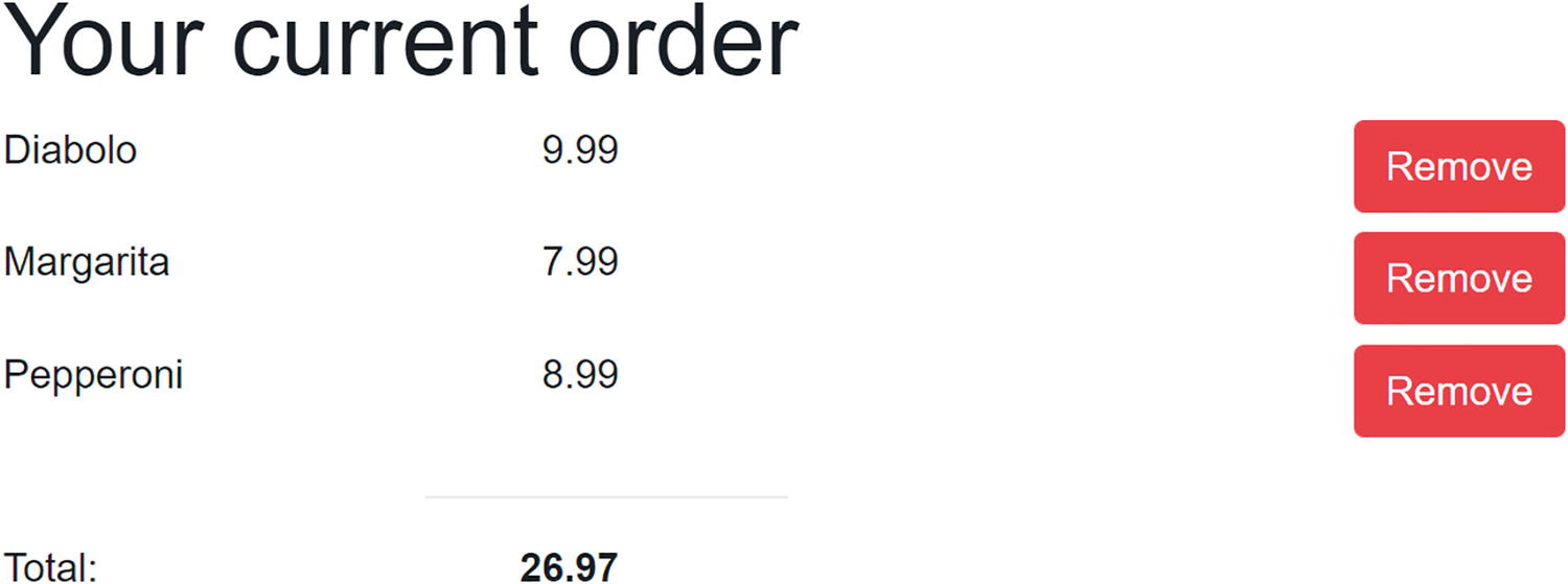
Run the application and order some pizzas. You should see your current order similar to Figure 2-7.
Figure 2-7
Your Shopping Basket with a Couple of Pizzas
Entering the Customer Information
Of course, to complete the order, we need to know a couple of things about the customer, especially we need to know the customer’s name and address because we need to deliver the order.
Start by adding the following razor to your Index.razor page as in Listing 2-44.
<!-- End shopping basket -->
<!-- Customer entry -->
<h1>Please enter your details below</h1>
<fieldset>
<div class="row mb-2">
<label class="col-2" for="name">Name:</label>
<input class="col-6" id="name"
@bind="State.Basket.Customer.Name" />
</div>
<div class="row mb-2">
<label class="col-2" for="street">Street:</label>
<input class="col-6" id="street"
@bind="State.Basket.Customer.Street" />
</div>
<div class="row mb-2">
<label class="col-2" for="city">City:</label>
<input class="col-6" id="city"
@bind="State.Basket.Customer.City" />
</div>
<button @onclick="PlaceOrder">Checkout</button>
</fieldset>
<!-- End customer entry -->
Listing 2-44
Adding Form Elements for Data Entry
This adds three <label>s and their respective <input>s for name, street, and city.
You will also need to add the PlaceOrder method to your @code as shown in Listing 2-45.
@code {
private State State { get; } = new State();
protected override void OnInitialized()
{
State.Menu.Add(
new Pizza(1, "Pepperoni", 8.99M, Spiciness.Spicy));
State.Menu.Add(
new Pizza(2, "Margarita", 7.99M, Spiciness.None));
The PlaceOrder method doesn’t do anything useful yet; we’ll send the order to the server later. This does however show a valid debugging technique in Blazor, where we place Console.WriteLine statements to see what gets executed.
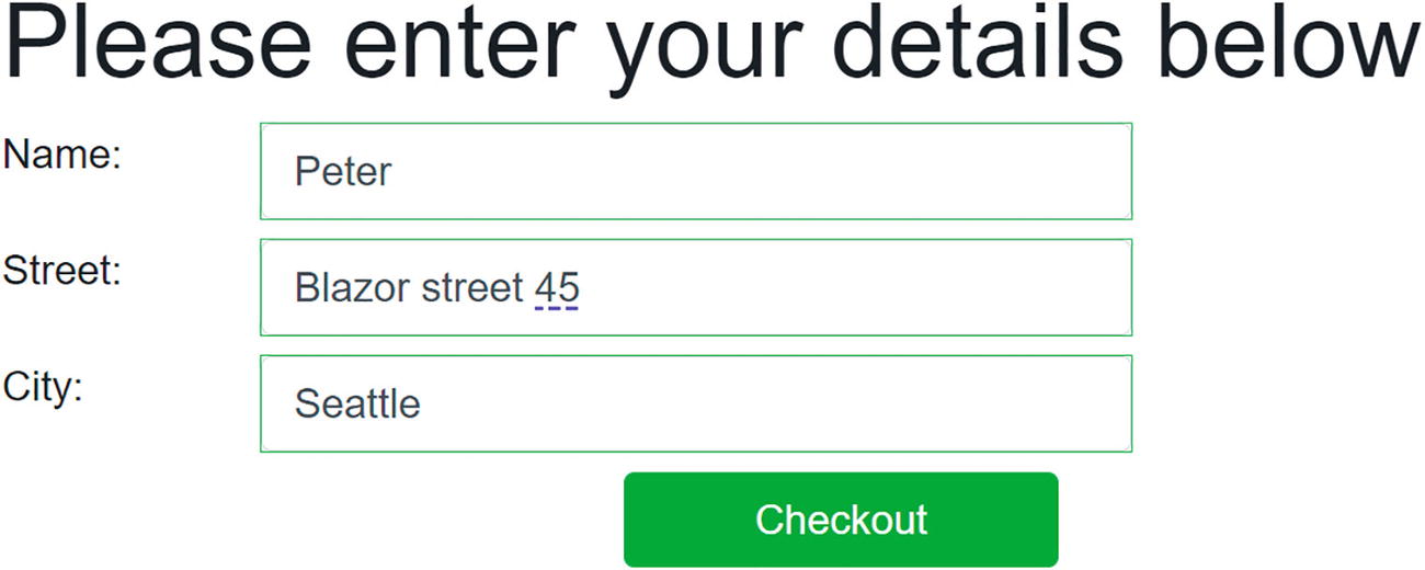
Run the application and enter your details, for example, as in Figure 2-8.
Figure 2-8
Filling Out the Customer Detail
Debugging Tip
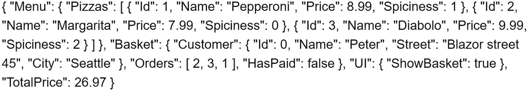
Even with modern debuggers, you want to see the State object because it contains the customer’s details and order as you are interacting with the application. Will we send the correct information to the server when we press the Checkout button? For this, we’ll use a simple trick by displaying the State on our page, so you can review it at any time.
Start by adding a new static class DebuggingExtensions to your Blazor client project as in Listing 2-46.
And at the bottom of Index.razor, add a simple paragraph as in Listing 2-47.
<!-- End customer entry -->
@State.ToJson()
@code {
Listing 2-47
Showing State
Run your project. As you interact with the page, you’ll see State change with an example shown in Figure 2-9.
Figure 2-9
Watching State Changes
It should be obvious that we remove this debugging feature when the page is ready . For example, you could add an #if DEBUG inside the ToJson method to only make it work outside release builds.
Blazor Validation
But wait! Clicking the Checkout button works, even while there is no customer name, address, or city! We need to do some validation! So, let’s start with an introduction to Blazor validation.
Letting Entities Validate Themselves
Classes like Customer should validate themselves because they have the best knowledge about the validity of their properties. .NET has a couple of built-in validation mechanisms, and here we are going to use the standard System.ComponentModel.DataAnnotations. In Chapter 3, we will look at using other validation mechanisms. With data annotations, you add attributes to your entity's properties, indicating what kind of validation is required.
Start by adding the System.ComponentModel.Annotations package to the PizzaPlace.Shared project.
Now add [Required] attributes to the Customer class as in Listing 2-48. These annotations make the Name, Street, and City properties mandatory. Use the ErrorMessage property to set the validation error message. You can add other attributes like [CreditCard], [EmailAddress], [MaxLength], [MinLength], [Phone], [Range], [RegularExpression], [StringLength], and [Url] for further validation.
using System.ComponentModel.DataAnnotations;
namespace PizzaPlace.Shared
{
public class Customer
{
public int Id { get; set; }
[Required(ErrorMessage = "Please provide a name")]
public string Name { get; set; } = default!;
[Required(ErrorMessage = "Please provide a street with house number.")]
public string Street { get; set; } = default!;
[Required(ErrorMessage = "Please provide a city")]
public string City { get; set; } = default!;
}
}
Listing 2-48
Adding Annotations for Validation
Using FormField and InputText to Enable Validation
Blazor comes with some built-in components that will perform validation for you. Replace the customer entry UI with Listing 2-49. Here, we replace the <input> HTML elements with built-in editing components. The EditForm component wraps around all the InputText components and will render as the HTML <form> element. The EditForm component has a Model property which you set to the instance you need to validate. When the user clicks the Submit button, the EditForm component performs validation, and when there are no validation errors, it will call the OnValidSubmit event.
Use the InputText component for each field, binding one to each property of the model using the @bind-Value attribute. This is the syntax used to tell the component to use two-way data binding between the Value property of the InputText component and the property of the model. Listing 2-49 has three such InputText components, one for Name, Address, and City.
Other input components also exist for other types, such as InputTextArea, InputRadio, InputRadioGroup, InputDate, InputCheckbox, InputSelect, and InputNumber. You can even build your own.
<!-- Customer entry -->
<h1 class="mt-2 mb-2">Please enter your details below</h1>
<EditForm Model="@State.Basket.Customer"
OnValidSubmit="PlaceOrder">
<fieldset>
<div class="row mb-2">
<label class="col-2" for="name">Name:</label>
<InputText class="form-control col-6"
@bind-Value="@State.Basket.Customer.Name" />
</div>
<div class="row mb-2">
<label class="col-2" for="street">Street:</label>
<InputText class="form-control col-6"
@bind-Value="@State.Basket.Customer.Street" />
</div>
<div class="row mb-2">
<label class="col-2" for="city">City:</label>
<InputText class="form-control col-6"
@bind-Value="@State.Basket.Customer.City" />
</div>
<div class="row mb-2">
<button class="mx-auto w-25 btn btn-success"
@onclick="PlaceOrder">Checkout</button>
</div>
</fieldset>
</EditForm>
<!-- End customer entry -->
Listing 2-49
Using EditForm and InputText
Showing Validation Errors
If you run the application right now, you will see that there is no validation yet. Why? Because Blazor allows you to choose between different validation systems (and even build your own), and we did not pick one! Here, we want to use data annotations for validation, so add the DataAnnotationsValidator component to the EditForm as in Listing 2-50.
<EditForm Model="@State.Basket.Customer"
OnValidSubmit="PlaceOrder">
<DataAnnotationsValidator />
<fieldset>
Listing 2-50
Adding DataAnnotationsValidator
Run the application again, and click the Checkout button. You will see that the inputs now receive a red border, because of validation errors. As a user, you would now wonder what you did wrong. So we need to show some error as feedback.
To show the validation message for each input, you add a ValidationMessage component and you set the For property to a delegate that returns the field to show validation messages for as in Listing 2-51.
<EditForm Model="@State.Basket.Customer"
OnValidSubmit="PlaceOrder">
<DataAnnotationsValidator />
<fieldset>
<div class="row mb-2">
<label class="col-2" for="name">Name:</label>
<InputText class="form-control col-6"
@bind-Value="@State.Basket.Customer.Name" />
</div>
<div class="row mb-2">
<div class="col-6 offset-2">
<ValidationMessage
For="@(() => State.Basket.Customer.Name)" />
</div>
</div>
<div class="row mb-2">
<label class="col-2" for="street">Street:</label>
<InputText class="form-control col-6"
@bind-Value="@State.Basket.Customer.Street" />
</div>
<div class="row mb-2">
<div class="col-6 offset-2">
<ValidationMessage
For="@(() => State.Basket.Customer.Street)" />
</div>
</div>
<div class="row mb-2">
<label class="col-2" for="city">City:</label>
<InputText class="form-control col-6"
@bind-Value="@State.Basket.Customer.City" />
</div>
<div class="row mb-2">
<div class="col-6 offset-2">
<ValidationMessage
For="@(() => State.Basket.Customer.City)" />
</div>
</div>
<div class="row mb-2">
<button class="mx-auto w-25 btn btn-success"
@onclick="PlaceOrder">Checkout</button>
</div>
</fieldset>
</EditForm>
Listing 2-51
Showing Validation Messages
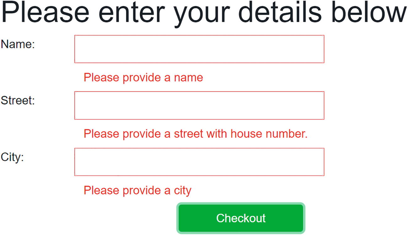
Build and run the PizzaPlace project. Click the Checkout button. You should get validation errors as shown in Figure 2-10. Blazor validation also adds some styles, and by default, this will put a red border around inputs with validation errors.
Figure 2-10
Showing Validation Errors
Note that the Checkout button does not invoke the PlaceOrder method if there are validation errors.
Now enter a name, street, and city. You should see the validation errors go away. You will also see green borders appear since the inputs are now valid.
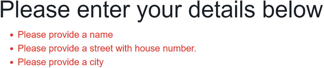
You can also use a ValidationSummary component which shows all the validation errors together as an unordered list. For example, you can add the ValidationSummary component below the DataAnnotationsValidator as in Listing 2-52. This will show all validation errors as in Figure 2-11.
<EditForm Model="@State.Basket.Customer"
OnValidSubmit="PlaceOrder">
<DataAnnotationsValidator />
<ValidationSummary/>
Listing 2-52
Using the ValidationSummary Component
Figure 2-11
The ValidationSummary’s Output
Customizing the Validation Feedback
When you enter a value in an InputText element (or one of the other input components), Blazor validation gives you feedback about the validity of the value by adding certain CSS classes. Let us have a look at how this is implemented. Run the PizzaPlace project, right-click one of the inputs, and then select Inspect from the browser’s menu.
Initially, an untouched input will have the valid class, as in Listing 2-53 (the other classes come from the class attribute in Listing 2-51).
<input class="form-control col-6 valid" ...>
Listing 2-53
Validation Uses the Valid CSS Class
When you make a valid change to an input, the modified class is added as in Listing 2-54.
Finally, validation messages get the validation-message CSS class, as in Listing 2-56.
<div class="validation-message">Please provide a name</div>
Listing 2-56
Validation Messages Use the validation-message Class
Out of the box, Blazor uses the following CSS styling for validation, as shown in Listing 2-57. You can find these CSS rules in wwwroot/css/app.css. Simply put, these add a green outline to an input if it has valid modifications and a red outline when the input has an invalid value.
.valid.modified:not([type=checkbox]) {
outline: 1px solid #26b050;
}
.invalid {
outline: 1px solid red;
}
.validation-message {
color: red;
}
Listing 2-57
Blazor’s built-in CSS Validation Rules
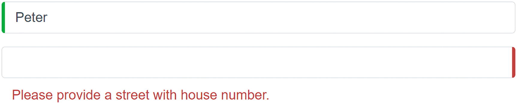
So, if you want to customize how your feedback looks like, you customize these CSS rules. For example, you can use the following CSS to wwwroot/css/app.css from Listing 2-58 to make validation look like Figure 2-12.
.valid.modified:not([type=checkbox]) {
border-left: 5px solid #42A948; /* green */
}
.invalid {
border-right: 5px solid #a94442; /* red */
}
.validation-message {
color: #a94442;
}
Listing 2-58
Some Custom CSS Rules to Change Validation Feedback
Figure 2-12
Customized Validation Feedback
Summary
In this chapter, we looked at data binding in Blazor. We started with one-way data binding where we can embed the value of a property or a field in the UI using the @SomeProperty syntax. We then looked at event binding where you bind an element’s event to a method using the on<event>="@SomeMethod" syntax. Blazor also has support for two-way data binding where we can update the UI with the value of a property and vice versa using the @bind="SomeProperty" syntax. Finally, we examined validation where we can use standard .NET validation techniques.
 . For example, you could add an #if DEBUG inside the ToJson method to only make it work outside release builds.